Ask five designers what a logo costs and you will get five numbers that appear to describe five different jobs. They usually do.
A logo is not one product. It is a mark chosen from a template in an afternoon, and it is an identity system built out of a positioning exercise, tested across forty applications, and handed over with the rights to use it. Both are honestly described as logo design. They are not the same purchase, and comparing their prices tells you nothing.
This piece sets out what actually moves the number: which tier of work you are buying, what sits on the invoice beneath the headline figure, who owns the result at the end, and which parts you can safely leave out. Read it before you brief and the quotes that come back will finally be comparable.
The four tiers, and what each one is for
Almost every logo quote in India sits in one of four bands. Knowing which one you are asking for is most of the work.
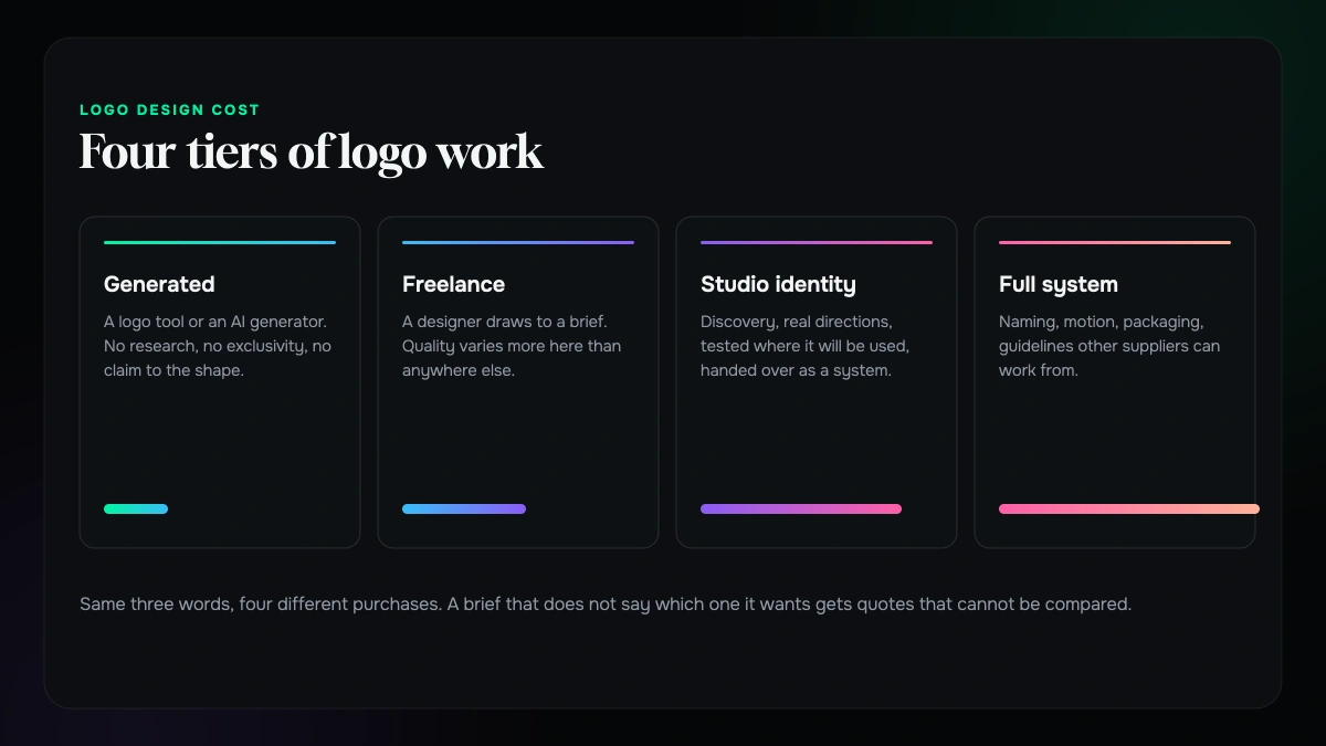
Generated marks. A logo tool or an AI generator produces something in minutes from a name and a category. There is no research and no exclusivity, and a similar prompt hands the same shape to someone else. Fine for a side project or an internal tool. A poor foundation for anything you intend to trademark.
Marketplace and freelance. A designer draws a mark to a brief. Quality varies more in this band than in any other, from excellent to traced clip art, and the price rarely tells you which you are getting. What is usually missing is not skill but process: no positioning before the sketching, few applications tested, and a thin handover.
Studio identity. A small team runs discovery, explores genuinely different directions, tests the mark where it will actually be used, and hands over a system rather than a file. The mark is one deliverable among several. Most funded startups and established SMEs land here.
Full identity system. Everything above, plus naming or repositioning, extended colour and typography, motion, packaging or environmental applications, and guidelines that let other suppliers work without you in the room. Usually a rebrand rather than a first mark.
The mistake is not choosing a lower band. It is briefing for one band and expecting the deliverables of another.
What is actually on the invoice
The headline figure hides the shape of the work. Ask for the lines and you will see which tier you are really being quoted.
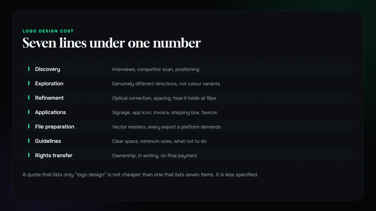
Discovery. Interviews, a competitor scan, positioning. On smaller jobs this is an hour on a call. On larger ones it is a workshop and a written summary.
Exploration. How many genuinely different directions get drawn, not how many colour variations of one idea.
Refinement. Optical correction, spacing, weight, how the mark holds at sixteen pixels. The invisible half of the work.
Applications. Where the mark is tested: signage, an app icon, an invoice, a shipping box, a favicon. Every application catches a problem the artboard hides.
File preparation. Vector masters, raster exports at every size a platform demands, single-colour and reversed versions, favicon and app icon sets.
Guidelines. Clear space, minimum sizes, what not to do. The document that stops the identity degrading the moment someone else touches it.
Handover and rights. The transfer of ownership, in writing.
A quote that lists only logo design is not cheaper than one that lists seven items. It is less specified.
Usage rights are the line nobody reads
This is the biggest hidden cost in Indian logo pricing, and it surfaces at the worst possible moment.
Some marketplace and freelance arrangements transfer limited rights, or none at all. The designer keeps ownership and licenses you the use. That is a legitimate model, and it is fine right up until you try to register a trademark, sell the company, or send files to a packaging supplier and find you are not the one who can authorise it.
Ask one question of every quote: on final payment, do I own the mark outright, worldwide, in perpetuity, including the right to modify it and register it as a trademark? The answer should be yes, in writing, in the proposal, before you pay a deposit. A designer who hesitates is telling you something useful.
The related trap is source files. A logo delivered as PNG and JPEG is not a logo you own in any practical sense. You need the editable vector master. Without it, every future change means someone redrawing your identity from a picture of it.
Revisions are where budgets actually break
Nearly every overrun on a logo project comes from the same place: revision rounds that were never defined.
Two rounds sounds generous until you learn what counts as a round. Is it one consolidated set of feedback from you, or every individual comment from four people in a group chat? Does a change of direction after approval count as a revision, or as a new project? Neither answer is wrong. Both need writing down.
The cost of leaving it vague is not money at first. It is time, then goodwill, then money. A project scoped for three weeks that runs eleven has cost you a launch date, the designer a margin, and both of you the working relationship.
Define a round as a single consolidated set of feedback, agree how many are included, and agree the rate for further ones. Then send feedback as a group, once.
A logo is not an identity, and you are usually buying an identity
Most people asking what a logo costs need more than a logo, and find that out afterwards.
A mark on its own answers almost nothing. It does not tell your web developer which typeface to set body copy in, or your printer which of your greens is the real one, or your social manager what the profile picture crops to. Those answers get invented, differently, by everyone who needs one. Six months later the brand looks like four brands.
The minimum useful system is small: the mark in its permitted variants, a defined palette with values for screen and print, one or two typefaces with a hierarchy, and a page on clear space and minimum sizes. Scoped from the start it is not an expensive addition. It is expensive to assemble later out of decisions other people already made for you. If you are replacing an identity rather than starting one, how to rebrand without losing recognition covers the part that goes wrong most often.
If a quote is only for a mark, ask what happens the first time someone needs a colour code.
What genuinely changes the number
Some things move a logo quote a great deal. Others move it far less than people expect.
Moves it a lot. Whether positioning work happens before the drawing. How many applications are tested, and how unusual they are, since embroidery, signage and packaging each impose constraints a screen never will. Whether a trademark search runs alongside the design, and whether the designer redraws if a conflict appears. The number of stakeholders holding approval rights, because four decision-makers is a different project from one whatever the brief says. And whether the identity extends into naming, tone of voice or motion.
Moves it less than you would think. Complexity of the drawing, since a simple mark usually takes longer rather than less time. The number of initial concepts, because ten weak directions cost more to produce and are harder to choose between than three considered ones. And where the studio is: rates do vary by city, but the tier of work you are buying explains far more of the difference than the pin on the map.
How to brief so the quotes come back comparable
Most people brief a logo by describing a picture. That is the least useful thing you can supply, and it is why quotes arrive in shapes you cannot lay side by side.
Supply these instead. What the business does, and for whom, in two paragraphs with no adjectives. Where the mark has to work, as a real list: app icon, website header, invoice, delivery box, shopfront, embroidered on a shirt. That single list changes more design decisions than any mood board. What already exists, including the current mark and anything carrying equity you would rather not throw away. Who approves, by name, and who breaks a tie. When you need it and what depends on that date, because a packaging print run is a hard deadline and a website launch usually is not. And what you need to own at the end.
A brief like that takes an hour to write and saves several weeks.
Five questions that separate a good quote from a cheap one
Ask these of every proposal. The answers sort the field quickly.
1. What happens before you start drawing? You are listening for a process, not a promise.
2. How many genuinely different directions will I see, and how many revision rounds are included? Both numbers, in writing.
3. Which applications will the mark be tested in before it is approved? If the answer is none, the first real test is the one you run in public.
4. What exactly do I receive at handover, and in what formats? Vector masters and a guidelines document, or a conversation about why not.
5. Do I own it outright on final payment, including the right to trademark it? Yes in writing, or keep looking.
None of these questions is about price, and every one of them will change the price you are quoted, because each changes what is being quoted for.
What we would cut, in order
If the budget is fixed and something has to give, cut in this order.
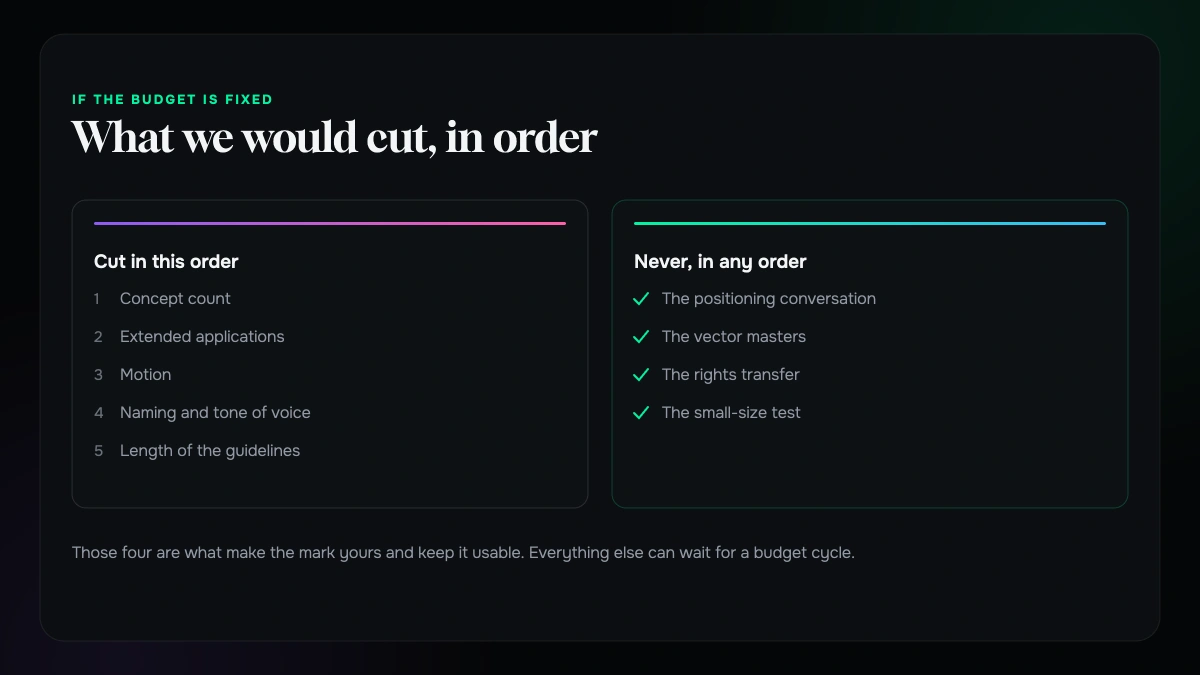
Concept count first: three considered directions beat ten thin ones. Then extended applications — test the five places the mark actually appears this year and add the rest when they exist. Then motion, which is genuinely valuable and almost never urgent for a first identity. Then naming and tone of voice, a separate project wearing the same invoice. Then the length of the guidelines document, where four useful pages outperform forty nobody opens.
What we would not cut, in any order: the positioning conversation, the vector masters, the rights transfer, and the small-size test. Those four are what make the mark yours and keep it usable. Everything else can wait for a budget cycle.
What it comes down to
Logo quotes vary wildly in India not because some designers are honest and others are not, but because the same three words describe four different jobs and almost nobody says which one they are quoting for.
Decide which tier your business actually needs. Brief it properly. Ask the five questions. Get the rights in writing. Do those four things and the numbers you receive will finally be describing the same work, which is the only way to tell good value from merely inexpensive.
If it helps to talk it through, this is what we do in branding and logo design, and from our Chowringhee Road studio for brands in Kolkata.
Tell us where the mark has to work and we will tell you which tier that is.
Send the list of places the logo has to live, anything that already exists, and any quote you are holding. We will come back with which tier the work actually sits in, what belongs in the handover, and what the rights clause should say.
If a smaller piece of work would do the job, we will say so rather than scope an identity system you do not need yet.
More on brand and design
Identity, packaging and what a redesign actually costs you.

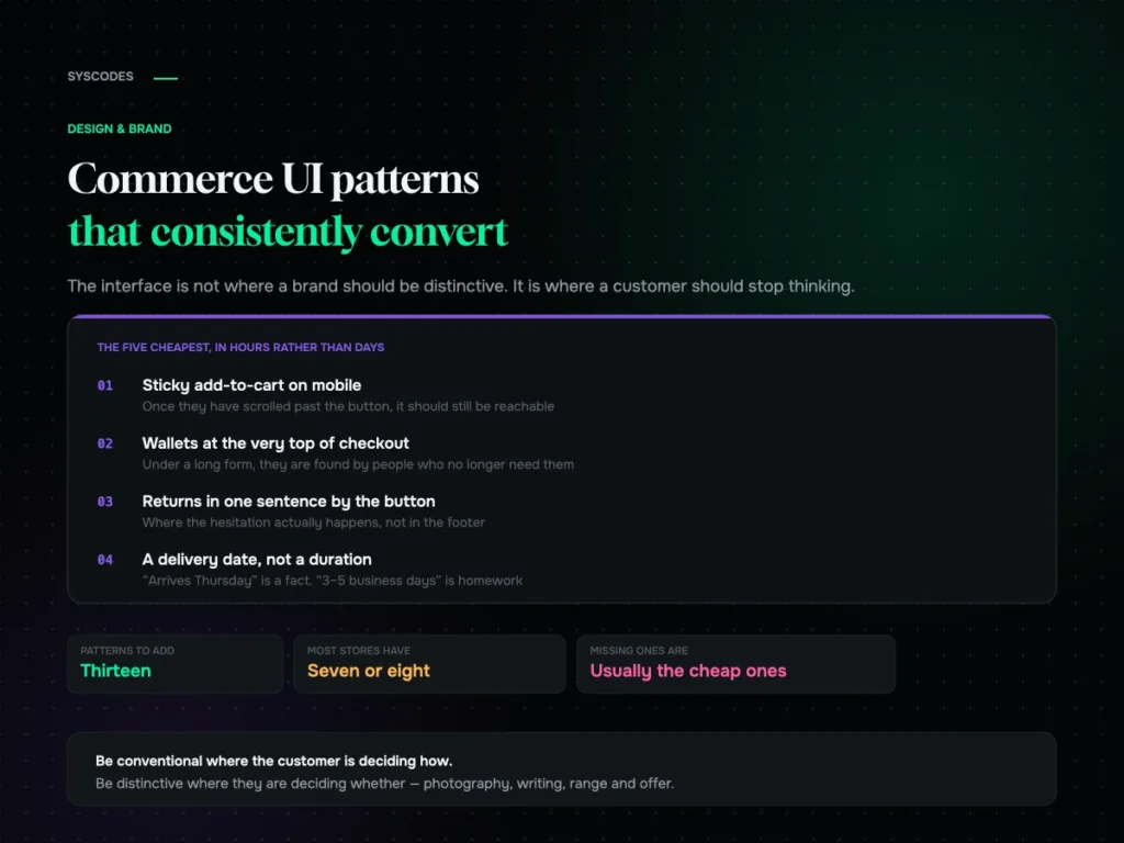
Commerce UI patterns that consistently convert
Thirteen commerce interface patterns grouped by funnel stage, the ones that present beautifully and cost orders, the states nobody designs, and how to add them without…
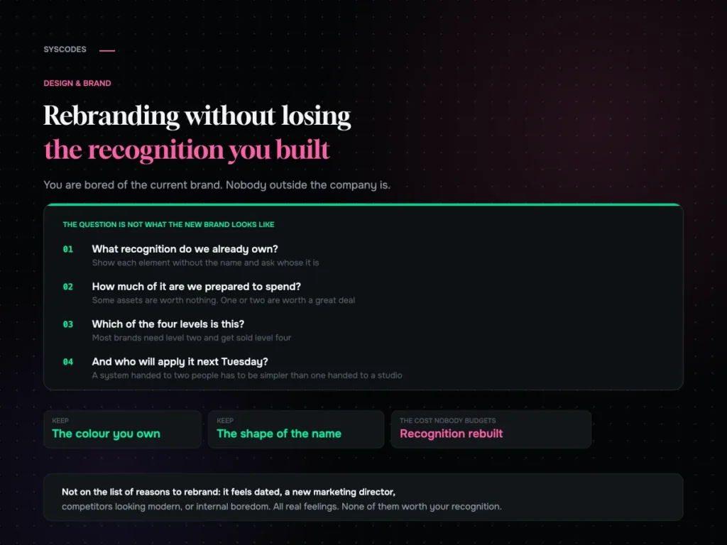
Rebranding without losing the recognition you have built
How to audit the recognition you already own, the four levels of rebrand and which one you probably need, what to keep, how to roll it…
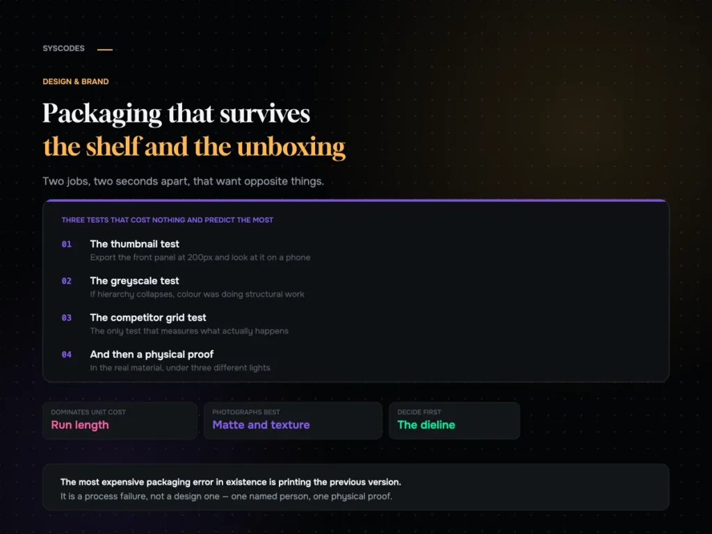
Packaging that survives both the shelf and the unboxing video
How the shelf and the unboxing want opposite things, three free tests every design should pass, what actually drives unit cost, and a pre-press checklist.
