
CRO · 7 weeks

The Legacy Line put the story before the price and lifted sales 38%.

The Legacy Line print twentieth-century American photographs onto coasters, mugs and canvases. Each piece scans to the story behind the image. The rebuild made that story the first thing a visitor meets.

30-min call with a senior lead · Reply within 1 business day · NDA on request

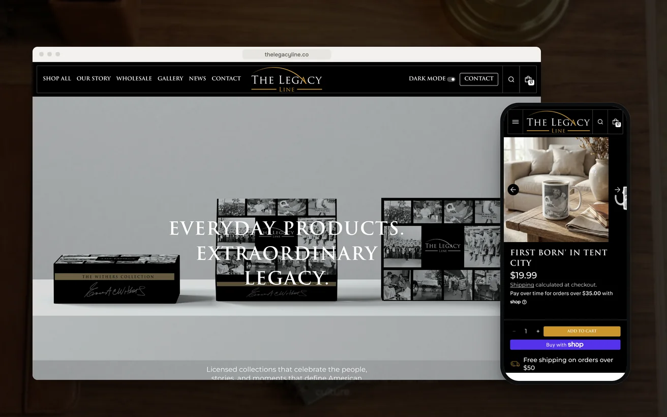
The Legacy Line's Shopify store on desktop and phone: the homepage and a mug product page
Client
The Legacy Line
Sector
Photographic homeware
Market
United States
Timeline
7 weeks
Services
Shopify Development, CRO, UI/UX
+38%

Sales

<1.5s

Page load

As reported by the client.

01 The challenge

The Legacy Line print archival twentieth-century American photography onto coasters, mugs and canvases. Every piece carries a scannable code that opens the story behind the image. The idea is sound and unusual. A buyer is not really paying for a mug. They are paying for a photograph they can explain to someone else.

The store sold all of that as homeware.

Photographs sat in a grid at thumbnail size with a price beside them and the story a click away. The obvious fix is better product photography. It was not a photography problem. The images were already the best thing here, and the site was hiding what they meant.

There was also an argument the team could not settle. Archival black-and-white does not behave against black the way it behaves against white. Some frames gain in the dark and others lose their mid-tones entirely. The disagreement had run for months, and every layout decision was waiting behind it.

02 Our approach

UX

This purchase is decided in an order the old page reversed. Someone reads the photograph, wants to know what it shows, and only then thinks about postage. So the plan was to rank the page in that order and let the story earn the price, rather than parking it behind a link.

Technical

Two viewing modes and print-grade photography pull against each other. Every image has to be sharp enough to justify a canvas and light enough to arrive quickly on a phone. That was going to be solved in the theme rather than by compressing the archive, because the imagery is the product.

Conversion

Nothing would be changed on opinion. Session recordings ran first, so each decision could point at a moment where a real visitor stopped. That included the presentation argument the team had been having, which was settled by watching what people did with the two modes rather than by taste.

03 Design & UX

The photograph leads at the largest size the layout allows, and the story sits directly beneath it. Price and format options come after both, because that is the order in which this purchase is decided. The specification table lost most of its rows. A coaster does not need a feature list when the argument is the image printed on it.

Both modes ship and the site remembers the choice. That is not a comfort setting. It is a second way to look at the stock, because the imagery changes meaningfully between them. On a phone the gallery becomes the page: full-width frames, story text that opens in place, and no fixed banner taking the top of the screen.

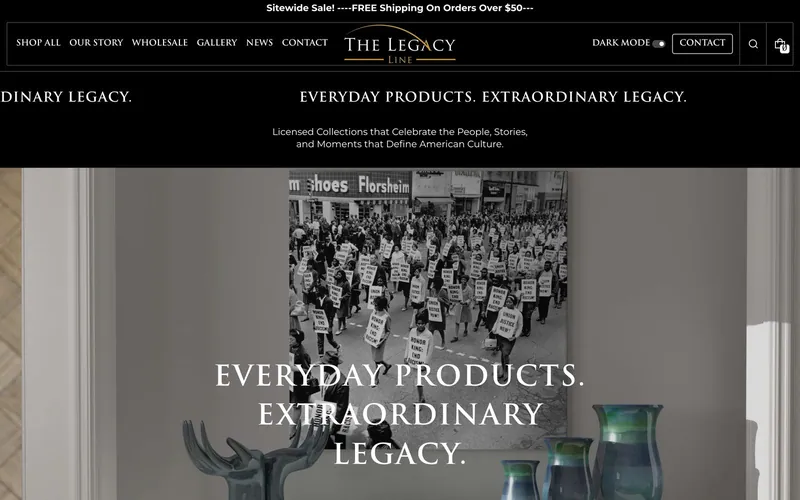
The The Legacy Line homepage on desktop

Story above the price

Visitors stop at the point the photograph gets interesting, so the page answers that instead of changing the subject to shipping.

Dark and light, remembered

Some archival frames gain against black while others lose their mid-tones, so the mode is a way of viewing the range rather than a preference.

The code shown as action

Hand somebody the coaster and they can find out what they are holding. That reads as a reason to buy. A small icon in a specification table does not.

Fewer rows, larger frames

The specification table was cut back so the image could run at a size that shows grain, because grain is what makes it archival.

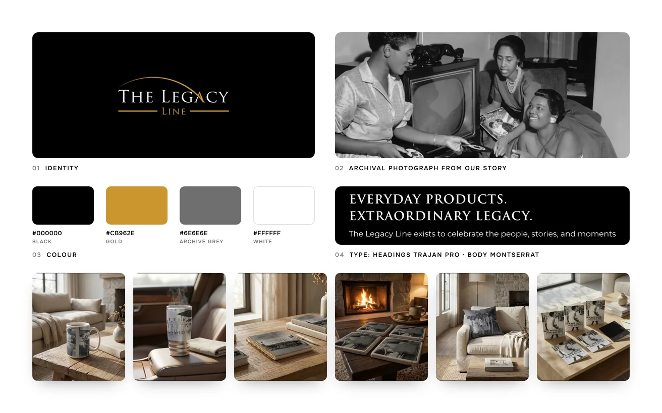
The Legacy Line brand board: logo, colour palette, typography, archival photograph from Our Story and the product range

04 Development & technical implementation

The rebuild sits on a Liquid theme with no page builder. Page builders add markup and script to every template, and on an image-led store that cost lands exactly where browsing happens. The story block, the code panel and the mode switch are part of the theme itself rather than apps stacked on top of it.

Images are served at the size the device asks for, in one modern format per browser. The archive stays high-resolution in the admin, and the storefront never sends a canvas-sized file to a phone. That is what keeps a gallery of large photographs quick enough to be worth scrolling through.

Hotjar and GA4 ran through the build rather than after it, so the ranking of the page could be checked against behaviour instead of assumed. Search Console tracked the archive as the story pages were indexed, which mattered because those stories are the part of this catalogue that reads as content.

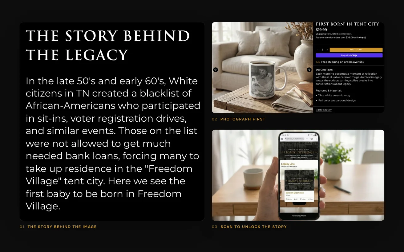
Close-ups of The Legacy Line: the story behind an archival photograph, the photograph-first product page and the scan-to-unlock-the-story AR feature

05Key solutions

Key solutions.

The parts of the build a visitor would point at.

  1. 01

    Story behind every image

    A scannable code opens the history of the photograph, which is the part of the purchase people actually talk about.

  2. 02

    Dark and light modes

    The store ships both and remembers the choice, so archival frames can be viewed the way each one reads best.

  3. 03

    Quick on heavy photography

    Pages stay fast even when the imagery is print-grade, so browsing does not end before the best frames appear.

  4. 04

    An archive worth searching

    Visitors can find a subject, an era or a place instead of scrolling a grid that treats every photograph as identical.

  5. 05

    Decisions from session data

    Recordings showed where people stopped, so the layout was ranked on what visitors did rather than on internal preference.

06The result

The result.

What changed after launch.

+38%

Sales

Sales are up 38%. The catalogue did not change and neither did the prices. What changed is that a visitor now meets the photograph before the product, and the story before the postage. People who understand what they are looking at buy more of it.

<1.5s

Page load

Pages load in under 1.5 seconds, which for an image-led store is the whole argument. Browsing is the behaviour that sells here, and a slow gallery ends it early. Speed is not a technical badge on this site. It is the difference between seeing four photographs and seeing forty.

The dual mode also settled the question the team had been running for months, and settled it with recordings rather than taste.

The answer was that both modes were needed. Decisions of that kind get cheap once somebody is watching real sessions instead of defending a preference.

Not sure where to start?

Tell us the number that is stuck. A senior lead replies within one business day with an honest view, free.

Book a free consultation

or WhatsApp +91 70034 16634

9.9/10 client score · 150+ projects · 100% on time

07The finished site

The finished site.

Live, and running the business it was built for.

Visit the live site (opens in a new tab)
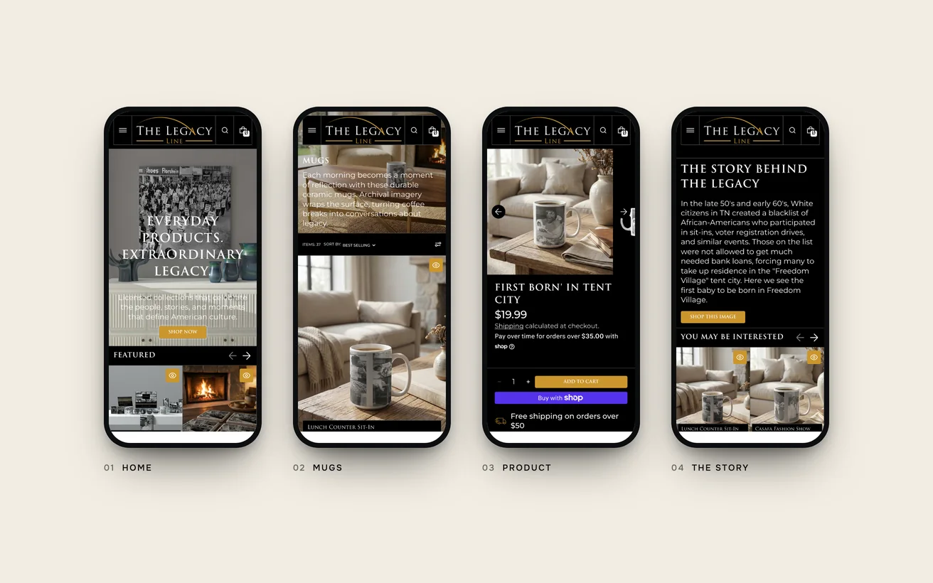
The finished Legacy Line store on phones: home, mugs, product and the story behind the image

08In their words

We argued about dark mode for a week. Then we watched people switch it on and stay longer, and the argument ended.

Laron A. Walker
Laron A. WalkerFounder, The Legacy Line

09Tech stack

Tech stack.

What it is built on, and what it talks to.

  • Shopify
  • Liquid
  • Hotjar
  • GA4
  • Search Console

10More case studies

More case studies.

Other projects where we named the number before we started.

CRO

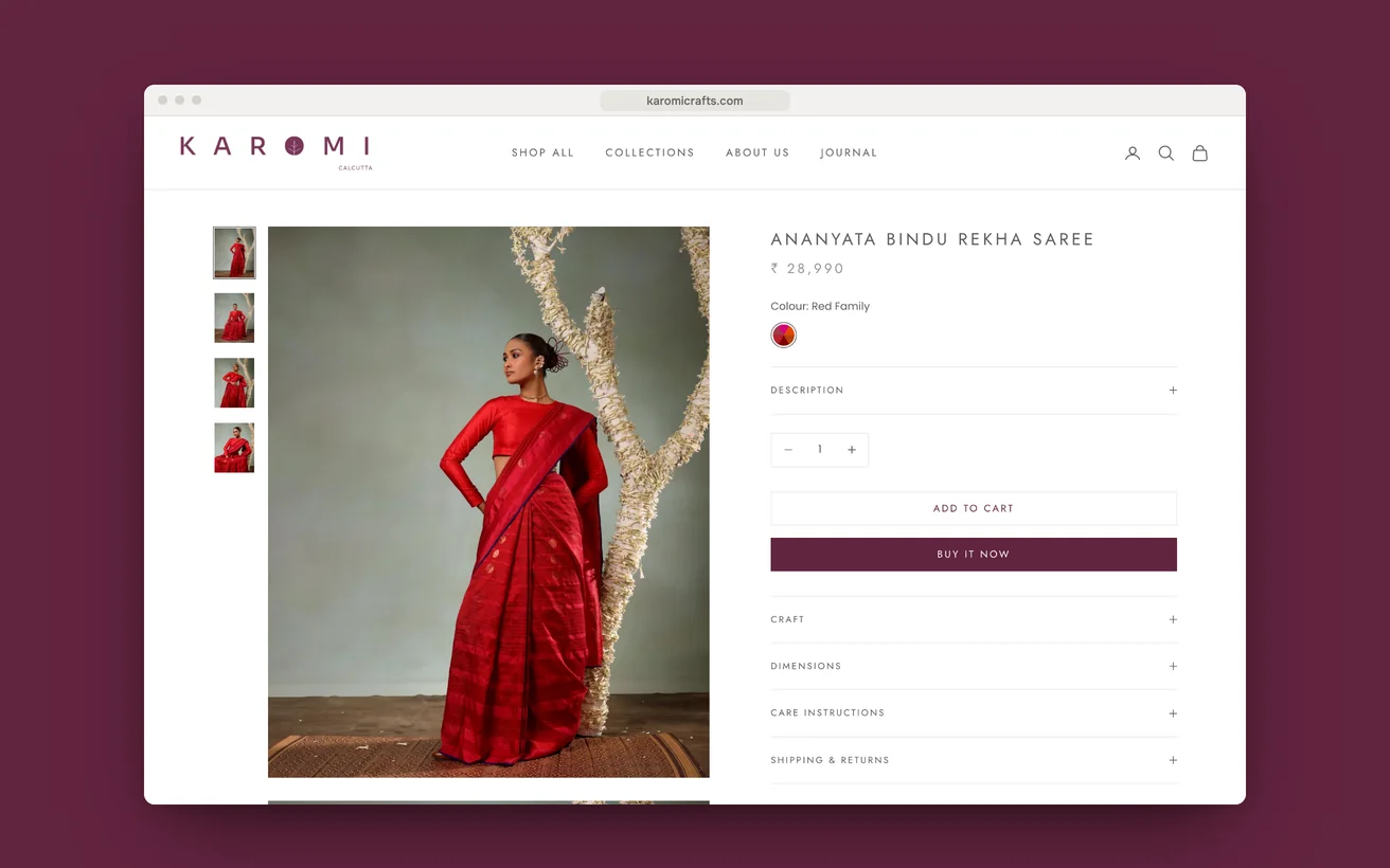
Karomi Crafts moved the loom time beside the price and lifted sales 30%.

A jamdani womenswear label with an existing store and the wrong problem. Traffic and taste were fine. The page never said what the cloth cost in time.

Sales
+30%
Page load
<1.2s
View case study

CRO

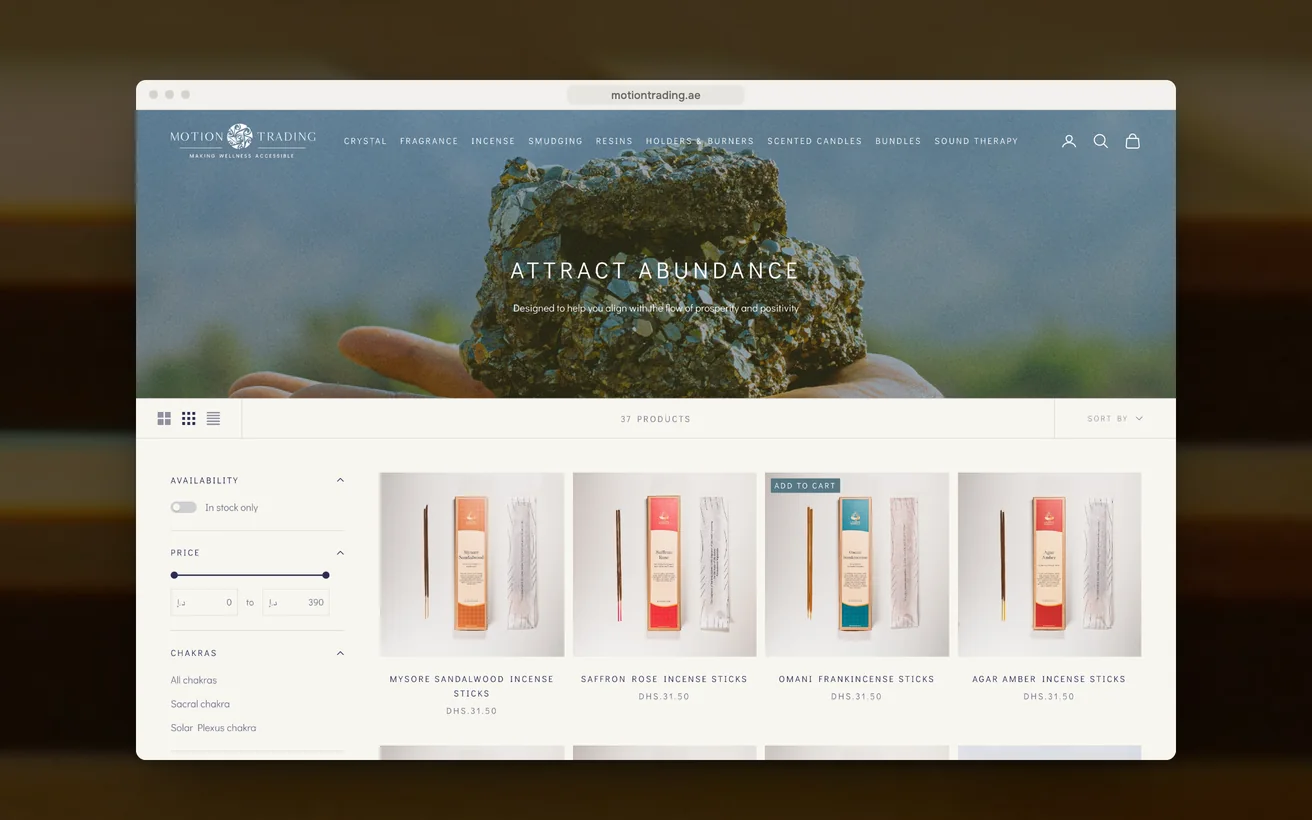
Motion Trading replaced a poorly built store and now converts at 6.85%.

Crystals, incense and sound therapy sold across the Gulf from a poorly built store. Rebuilt around provenance, meaning and a checkout that gets out of the way.

Conversion rate
6.85%
Organic traffic
+30%
View case study

eCommerce

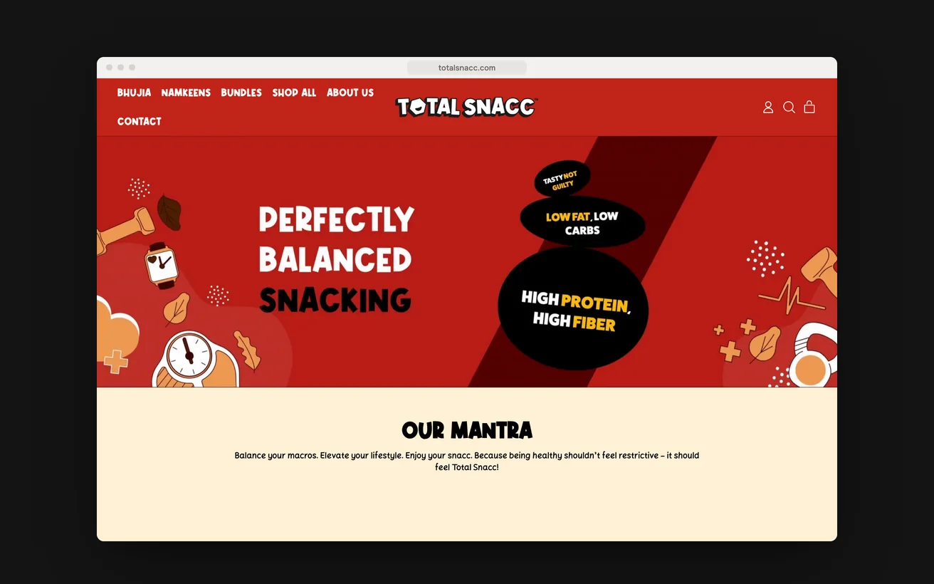
TotalSnacc launched from a standing start and took six figures in month one.

A launch store for roasted, never fried namkeen, built with no customer list behind it. Every rival in the category claims to be healthy and nobody is believed.

Revenue, month one
6 figures
Page load
<2s
View case study

11Start a project

Let us look at your numbers.

Send the metric that is stuck and we will tell you honestly whether we agree.

  1. Within 1 business dayWe read it properly and reply with real questions, not a templated brochure.
  2. A 30-minute scoping callFree, no obligation. We tell you honestly if we are the wrong fit.
  3. A written proposalScope, timeline, deliverables and the success metric, all on one page.

You'll hear back from a senior lead, never a bot.

    What do you need?

    NDA on request · Details never shared

    Question about your project? Tell us in 30 seconds and a senior lead replies.