
CRO · 7 weeks

Karomi Crafts moved the loom time beside the price and lifted sales 30%.

Karomi Crafts turn handwoven jamdani into contemporary womenswear from Kolkata. The store already existed and the traffic was healthy. The project rebuilt the path from admiring the cloth to buying it.

30-min call with a senior lead · Reply within 1 business day · NDA on request

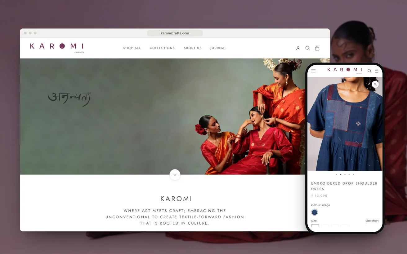
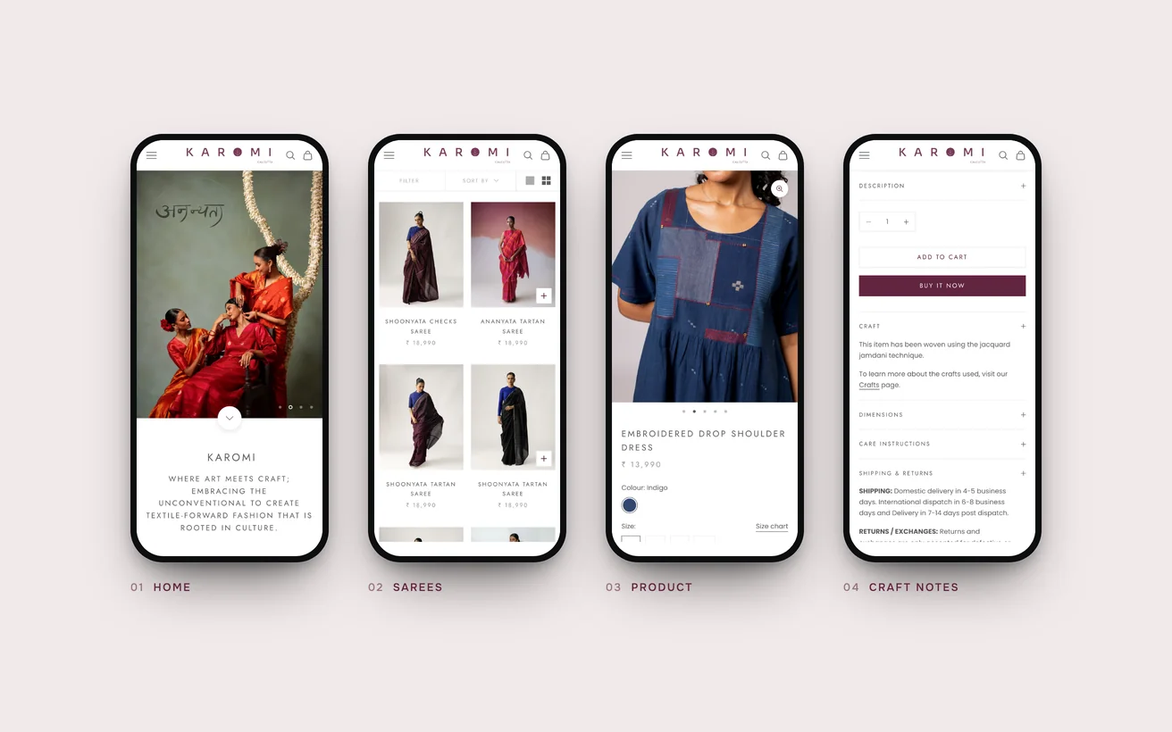
Karomi Crafts' Shopify store on desktop and phone: the homepage and an embroidered handloom dress product page
Client
Karomi Crafts
Sector
Handloom fashion
Market
India, shipping internationally
Timeline
7 weeks
Services
Shopify Development, CRO, UI/UX
+30%

Sales

<1.2s

Page load

As reported by the client.

01 The challenge

Karomi Crafts turn handwoven jamdani into contemporary womenswear, made in Kolkata and worn now rather than kept for occasions. The label is careful about what it claims. Sustainability is described by who wove the cloth and how long it took, not by a badge in the footer. The photography was good and the range was coherent.

People arrived, looked for a long time and left.

Read quickly, that is a conversion problem, and the usual answer is a discount code and a louder button. Neither would have worked here. The visitor was not undecided about the garment. They had no way to judge what they were being asked to pay for.

A single jamdani piece can take weeks on the loom. That fact was on the site, in an about page nobody opens before checking a price. The product page carried a photograph, a size chart and a number. Set against a mill-woven copy in another tab, it lost every time, because nothing on it explained the difference.

02 Our approach

UX

The decision was to treat making as product information rather than brand story. A buyer in this category reads the label before the price. So loom time, weave and the reason two pieces of one design differ had to sit on the product page itself. An about link is where a shopper puts what they have already decided not to read.

Technical

Handloom sells on texture, so the photography had to stay large and plentiful. That is usually where a fashion store loses its speed, and speed decides whether an Indian mobile visitor sees the collection at all. So the theme was planned without a page builder, with image weight treated as a design constraint rather than a later fix.

Conversion

Urgency was ruled out before anything was designed. A label that refuses to overstate its sustainability cannot invent scarcity on the way to checkout, because the buyer it wants is the one who checks. The scarcity in handloom is real, so the plan was to report it plainly and let the number do its own work.

03 Design & UX

The product page ranks by what the buyer still does not know. Image first, then the making, then the price. Loom time and weaver credit sit above the fold, where a headline usually goes. The countdown, the low-stock badge on everything and the popup code were all left out. A page that shouts undermines the one claim this brand makes carefully.

On a phone the making has to survive the scroll. It is set as short lines a thumb passes rather than a paragraph, so a visitor picks up the weave and the weeks without stopping. Photographs run full width because texture is the argument. The size chart and care notes sit lower down, where a buyer looks for them only after deciding.

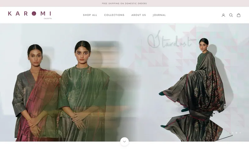
The Karomi Crafts homepage on desktop

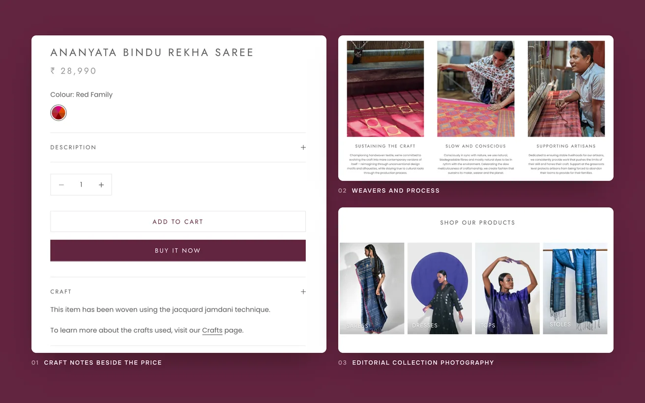
Loom time beside the price

A buyer comparing a handloom piece to a mill-woven copy needs the difference stated where the cost is stated, not in an about section.

Real counts, no countdown

The page reports the actual number of pieces left in a weave and says nothing more, because invented urgency is the one thing this label cannot afford.

Weaver credit above the fold

We argued for a clean first screen and lost. The founder was right, and the session recordings settled it inside a week.

No page builder

Large photography is the product, so the theme was written directly to keep the images full size and the pages quick on a mobile connection.

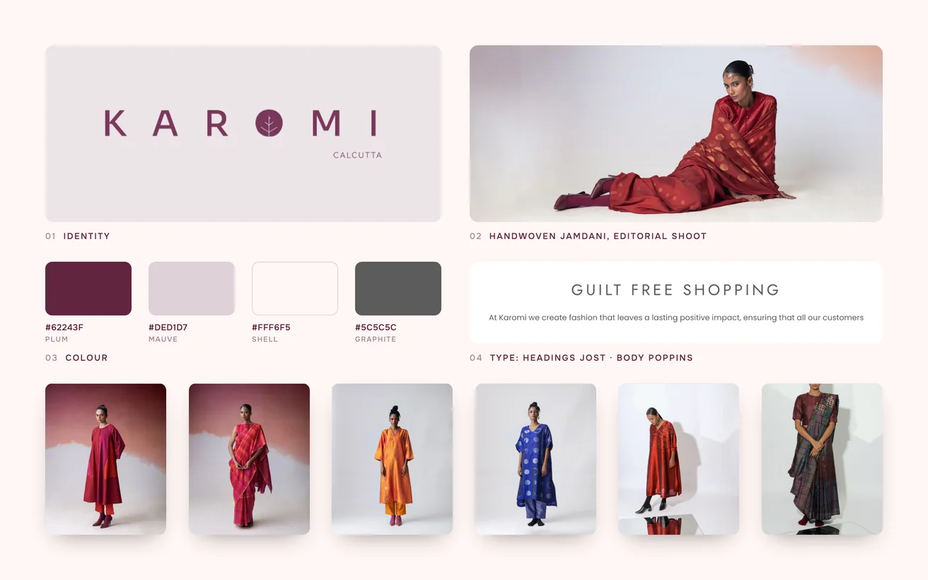
Karomi brand board: logo, colour palette, typography, handwoven jamdani, editorial shoot and the product range

04 Development & technical implementation

The making lives in metafields rather than in typed copy. Weave, loom time and the count of pieces in a run are structured fields the team fills in. Liquid renders them on the product page and on the collection card. That means the detail arrives with every new piece instead of depending on somebody remembering to write it.

Speed was earned in the theme rather than by cropping the archive. Every image is served as WebP and sized for the device asking for it, so a phone never downloads a desktop file. Nothing below the fold loads until it is needed. No page builder was installed, which keeps the markup close to what the page actually renders.

GA4 and Hotjar were installed before the redesign, not after it. Session recordings settled an internal disagreement inside a week, which is faster than any meeting would have. Klaviyo picks up the visitor who leaves a piece in the basket and sends the loom detail rather than a code. The email repeats the argument the page makes.

Close-ups of Karomi: craft notes beside the price, the weavers and process section and the editorial collection photography

05Key solutions

Key solutions.

The parts of the build a visitor would point at.

  1. 01

    Making beside the price

    Weave, loom time and the reason two pieces differ sit on the product page, where the buyer is deciding what the garment is worth.

  2. 02

    Structured weave fields

    Every piece carries the same set of craft details, so nothing depends on a description being written from memory each time.

  3. 03

    Full-size photography, quick pages

    Images are served as WebP and sized per device, so texture survives at full resolution without costing a mobile visitor the page.

  4. 04

    Honest stock counts

    The page reports how many pieces remain in a weave and adds no countdown, because the buyer this label wants is the one who checks.

  5. 05

    Basket emails that explain

    A visitor who leaves a piece behind receives the loom detail rather than a discount, which keeps the brand argument consistent after the visit.

06The result

The result.

What changed after launch.

+30%

Sales

Sales are up 30%, on the same catalogue and the same photography. Nothing was reshot and no line was added to the range. The gain came from visitors who were already close and were missing one fact at the moment they needed it. Weeks on a loom explains a garment better than any adjective can.

<1.2s

Page load

Pages load in under 1.2 seconds with the photography at full size and nothing cropped to get there. On an Indian mobile connection a slow collection page is a closed tab, and a closed tab is a visitor the brand paid for twice. Speed here is not a technical score. It is the cost of being seen.

The team now writes the loom detail themselves, for every new piece, because it turned out to be the part that sells.

That is the change that outlasts the project. A store can be redesigned once. A team that knows which fact closes the sale keeps applying it to everything that follows.

Not sure where to start?

Tell us the number that is stuck. A senior lead replies within one business day with an honest view, free.

Book a free consultation

or WhatsApp +91 70034 16634

9.9/10 client score · 150+ projects · 100% on time

07The finished site

The finished site.

Live, and running the business it was built for.

Visit the live site (opens in a new tab)
The finished Karomi store on phones: home, sarees, product and craft notes

08In their words

We were never short of compliments. The site now turns some of them into orders, which is a different thing entirely.

Founder, Karomi Crafts

09Tech stack

Tech stack.

What it is built on, and what it talks to.

  • Shopify
  • Liquid
  • GA4
  • Hotjar
  • Klaviyo

10More case studies

More case studies.

Other projects where we named the number before we started.

CRO

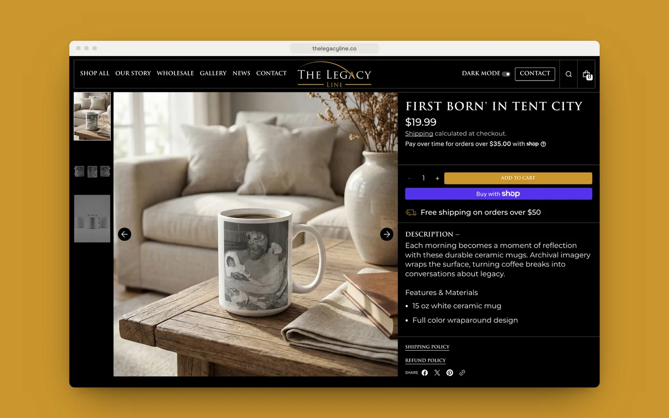
The Legacy Line put the story before the price and lifted sales 38%.

Archival photography printed onto homeware, each piece scannable to the story behind it. Rebuilt in dark and light mode, from session data rather than opinion.

Sales
+38%
Page load
<1.5s
View case study

CRO

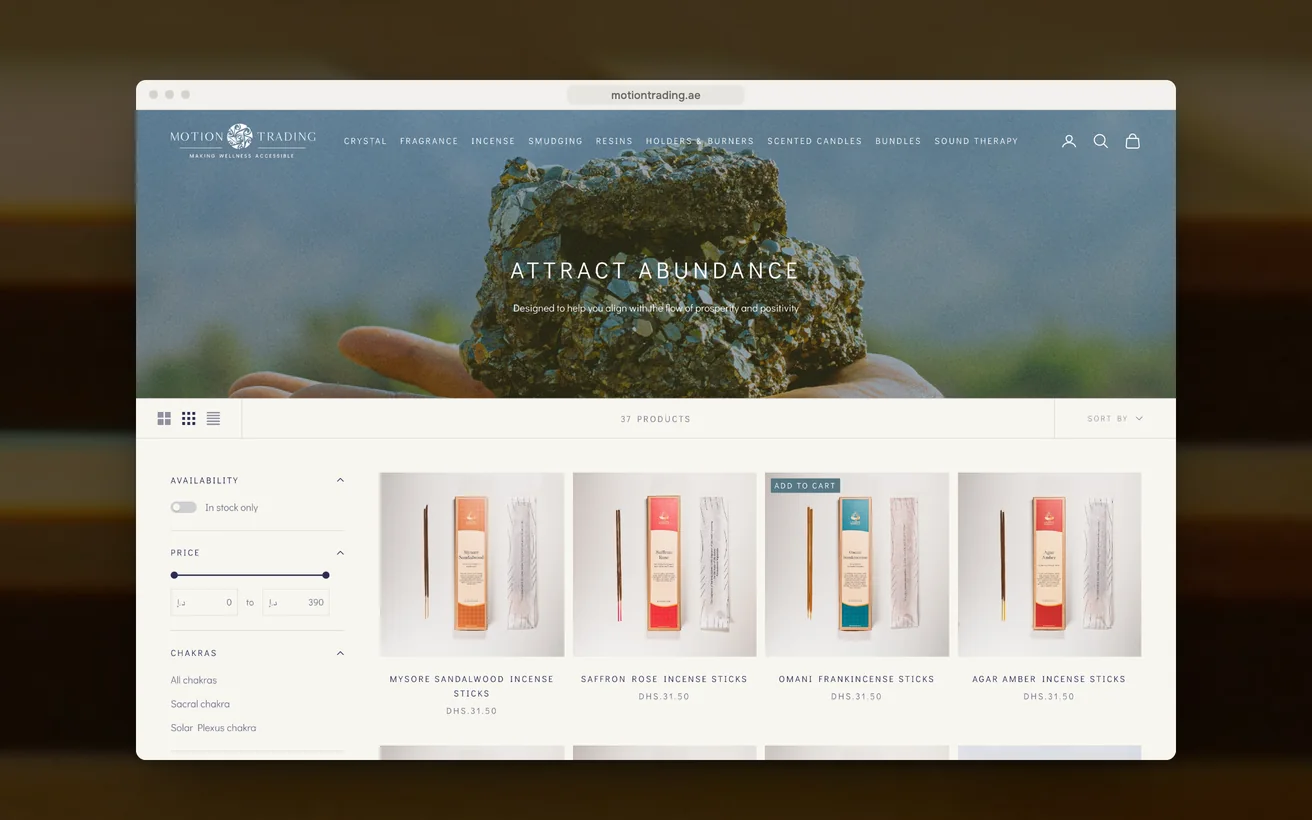
Motion Trading replaced a poorly built store and now converts at 6.85%.

Crystals, incense and sound therapy sold across the Gulf from a poorly built store. Rebuilt around provenance, meaning and a checkout that gets out of the way.

Conversion rate
6.85%
Organic traffic
+30%
View case study

eCommerce

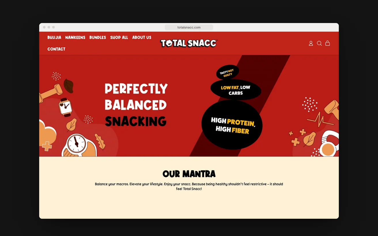
TotalSnacc launched from a standing start and took six figures in month one.

A launch store for roasted, never fried namkeen, built with no customer list behind it. Every rival in the category claims to be healthy and nobody is believed.

Revenue, month one
6 figures
Page load
<2s
View case study

11Start a project

Let us look at your numbers.

Send the metric that is stuck and we will tell you honestly whether we agree.

  1. Within 1 business dayWe read it properly and reply with real questions, not a templated brochure.
  2. A 30-minute scoping callFree, no obligation. We tell you honestly if we are the wrong fit.
  3. A written proposalScope, timeline, deliverables and the success metric, all on one page.

You'll hear back from a senior lead, never a bot.

    What do you need?

    NDA on request · Details never shared

    Question about your project? Tell us in 30 seconds and a senior lead replies.