CRO · 7 weeks

Motion Trading replaced a poorly built store and now converts at 6.85%.

Motion Trading sell crystals, incense and sound-therapy pieces across the UAE and the wider Gulf. The rebuild gave a meaning-led range the storytelling and the checkout it had been missing.

30-min call with a senior lead · Reply within 1 business day · NDA on request

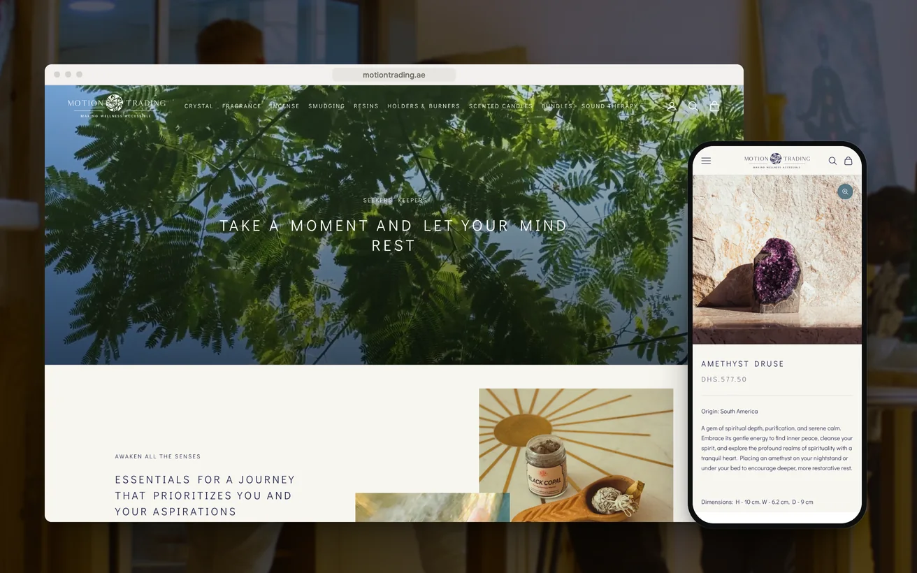
Motion Trading's Shopify store on desktop and phone: the homepage and the Amethyst Druse product page
Client
Motion Trading
Sector
Crystals and wellbeing
Market
UAE and the Gulf
Timeline
7 weeks
Services
Shopify Development, CRO, UI/UX
6.85%

Conversion rate

+30%

Organic traffic

As reported by the client.

01 The challenge

Motion Trading sell crystals, incense and sound-therapy pieces across the UAE and the wider Gulf. The range and the sourcing were already right. What the category demands is patience. A buyer wants to know what a piece is, where it came from and what it is for. All of that gets read before anything is decided.

The store was built badly and it showed.

Photography was flat, the descriptions were thin, and the path from a product to a completed order asked the customer for the same information twice. The obvious fix is a nicer theme. A theme cannot answer the question this buyer arrives with.

Underneath that sat a second problem. Nothing in the catalogue was structured, so two pieces could not be compared and the range could not be searched properly. A shopper weighing one stone against another had to read two paragraphs and hope the same fact appeared in both.

02 Our approach

UX

This category is sold on how an object feels in the hand. A thumbnail on a white background communicates none of that, so the pieces would be shot large and dark, with the stone as the light in the frame. Scale, texture and weight were to lead the page ahead of price.

Technical

Consistency was chosen over eloquence. Every product would carry the same facts in the same place, held as structured fields rather than written into a paragraph. That decision was taken for two reasons: comparison, which shoppers here do constantly, and search, which cannot index a fact buried in prose.

Conversion

The checkout was treated as the place the store lost people who had already decided. Gulf addresses do not fit a form written for postcodes, so the address step would be rebuilt rather than patched. A cheaper build keeps the default form and blames the drop-off on the market.

03 Design & UX

Product photography runs large and dark, the piece lit against a low background so the surface reads. Price sits beneath the object rather than beside it, because nobody in this category decides on price first. Collection pages were slowed down on purpose: fewer items in view, more space around each one, and no promotional furniture competing with the stone.

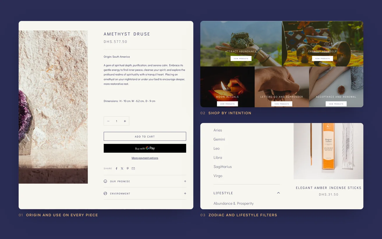
The same four facts appear in the same position on every page: the stone, its origin, its traditional use and how to look after it. On a phone they stack as a short list above the longer description, so a comparison can be made by scrolling rather than by reading. The checkout drops to one column, in the order a Gulf customer would give an address.

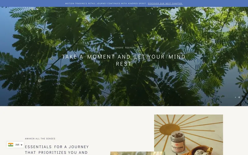
The Motion Trading homepage on desktop

Dark, large photography

Weight and texture are the argument in this category, and neither one survives a small image on a white background.

The same four facts

Someone weighing two pieces is comparing fields, not prose, so origin and traditional use sit in the same place on every page.

Address by building and area

Gulf addresses are given as building, area and emirate, so the form asks for those instead of a postcode nobody uses.

Empty rather than invented

Provenance that could not be verified was left structured and blank, because invented origin is the one claim this buyer checks.

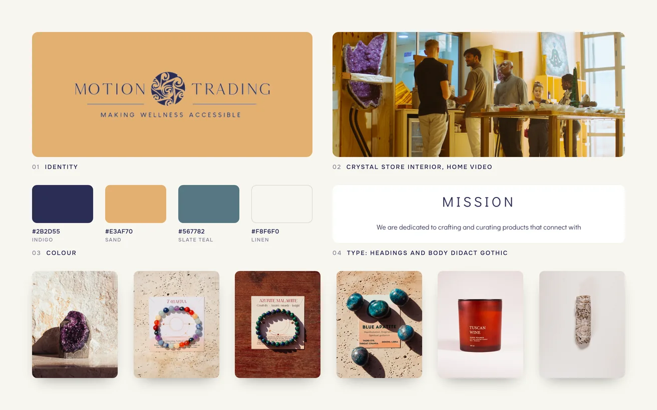
Motion Trading brand board: logo, colour palette, typography, crystal store interior, home video and the product range

04 Development & technical implementation

The storefront is a Liquid theme built on metafields rather than free text. The stone, its origin, its traditional use and its care instructions are separate fields on every product, which is what makes them comparable, filterable and indexable. Adding a new piece became a matter of filling fields instead of writing a page.

The checkout was shortened to the fields an order actually needs, and the duplicated step was removed. The address form was rebuilt around building, area and emirate. Shopify Markets handles currency and delivery across the region, so a customer outside the UAE is not treated as an exception by the store.

One constraint shaped the schedule. The catalogue arrived without provenance for a good part of the range, and the supplier could not confirm all of it inside seven weeks. Rather than invent it, the verified fields shipped and the rest stayed structured and empty. Those pages fill in as the sourcing is confirmed.

Close-ups of Motion Trading: origin and use on every piece, shop by intention, and zodiac and lifestyle filters

05Key solutions

Key solutions.

The parts of the build a visitor would point at.

  1. 01

    Photography that carries weight

    Pieces are shot large and dark so texture and scale read on screen, which is how this category is actually judged.

  2. 02

    The same facts everywhere

    Stone, origin, traditional use and care sit in fixed fields, so two pieces can be compared without reading two descriptions.

  3. 03

    Filter by purpose

    Structured fields let visitors narrow the range by stone or by what it is for, instead of scrolling the whole catalogue.

  4. 04

    A checkout that stops asking

    The duplicated step is gone and the fields are down to what an order needs, so a decided buyer is not lost at the end.

  5. 05

    Built for Gulf addresses

    The address step asks for building, area and emirate, which is how customers across the region actually give their location.

  6. 06

    Pages that answer searches

    Consistent facts turned the catalogue into pages that match how people search: by stone name and by what it is for.

06The result

The result.

What changed after launch.

6.85%

Conversion rate

The store runs at a conversion rate of 6.85%. For a considered purchase in this category, that is well above what stores normally do. It is not one change either. The pages answer the question, the photography carries the weight, and the checkout stops losing people who had already decided.

+30%

Organic traffic

Organic traffic is up 30%. Writing the same facts about every piece, in the same structure, turned a catalogue into pages that answer real searches. People look for a stone by name and by what it is for. The store now has a page for both.

The two figures hold each other up.

More of the traffic now arrives knowing what it wants, and the pages it lands on are built to confirm rather than to persuade. A conversion rate that stays steady while the audience grows is the harder half of this result.

Not sure where to start?

Tell us the number that is stuck. A senior lead replies within one business day with an honest view, free.

Book a free consultation

or WhatsApp +91 70034 16634

9.9/10 client score · 150+ projects · 100% on time

07The finished site

The finished site.

Live, and running the business it was built for.

Visit the live site (opens in a new tab)
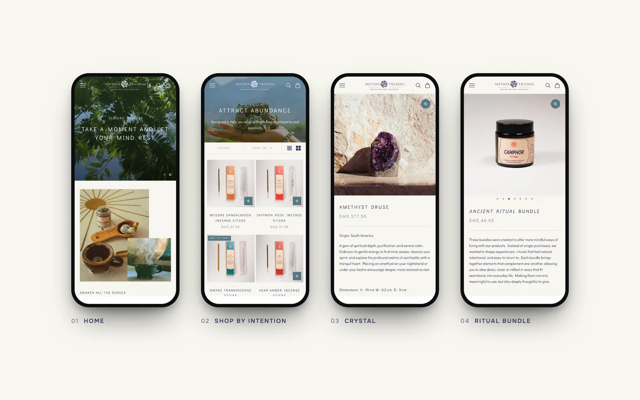
The finished Motion Trading store on phones: home, shop by intention, a crystal and a ritual bundle

08In their words

People here take their time choosing a piece. The new site lets them, and then it gets out of the way at the checkout.

Founder, Motion Trading

09Tech stack

Tech stack.

What it is built on, and what it talks to.

  • Shopify
  • Liquid
  • Shopify Markets
  • GA4
  • Hotjar

10More case studies

More case studies.

Other projects where we named the number before we started.

CRO

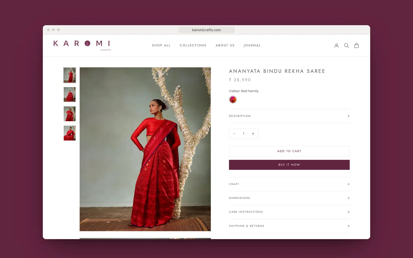
Karomi Crafts moved the loom time beside the price and lifted sales 30%.

A jamdani womenswear label with an existing store and the wrong problem. Traffic and taste were fine. The page never said what the cloth cost in time.

Sales
+30%
Page load
<1.2s
View case study

CRO

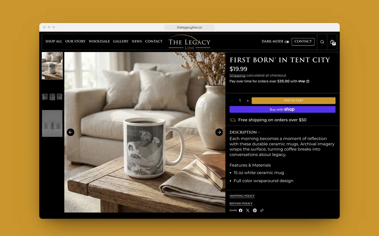
The Legacy Line put the story before the price and lifted sales 38%.

Archival photography printed onto homeware, each piece scannable to the story behind it. Rebuilt in dark and light mode, from session data rather than opinion.

Sales
+38%
Page load
<1.5s
View case study

eCommerce

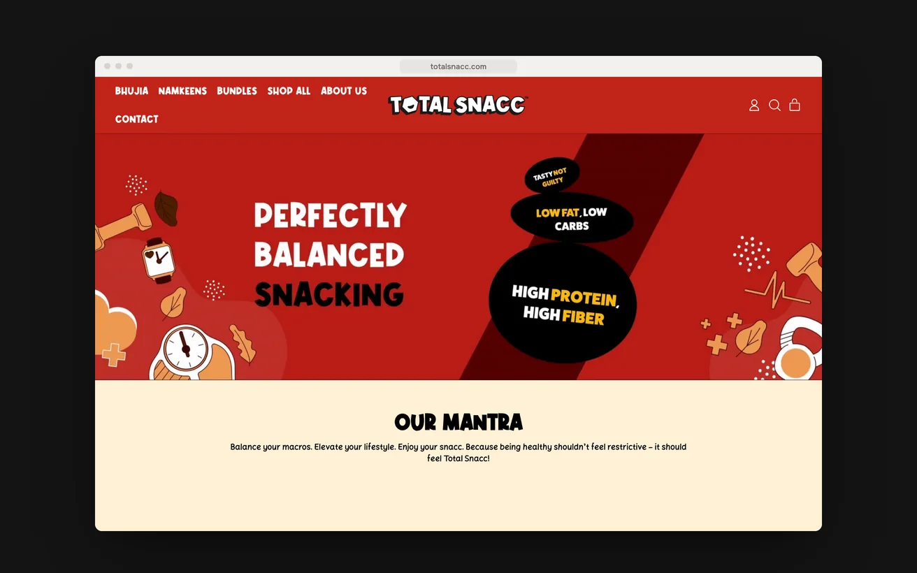
TotalSnacc launched from a standing start and took six figures in month one.

A launch store for roasted, never fried namkeen, built with no customer list behind it. Every rival in the category claims to be healthy and nobody is believed.

Revenue, month one
6 figures
Page load
<2s
View case study

11Start a project

Let us look at your numbers.

Send the metric that is stuck and we will tell you honestly whether we agree.

  1. Within 1 business dayWe read it properly and reply with real questions, not a templated brochure.
  2. A 30-minute scoping callFree, no obligation. We tell you honestly if we are the wrong fit.
  3. A written proposalScope, timeline, deliverables and the success metric, all on one page.

You'll hear back from a senior lead, never a bot.

    What do you need?

    NDA on request · Details never shared

    Question about your project? Tell us in 30 seconds and a senior lead replies.