
eCommerce · 6 weeks

Attackletics doubled sales with a neon storefront that opens like a plain one.

Attackletics build a smart batting tee and a coaching app for baseball and softball hitters. Both were finished. The storefront selling them was a stock theme that gave no hint of either.

30-min call with a senior lead · Reply within 1 business day · NDA on request

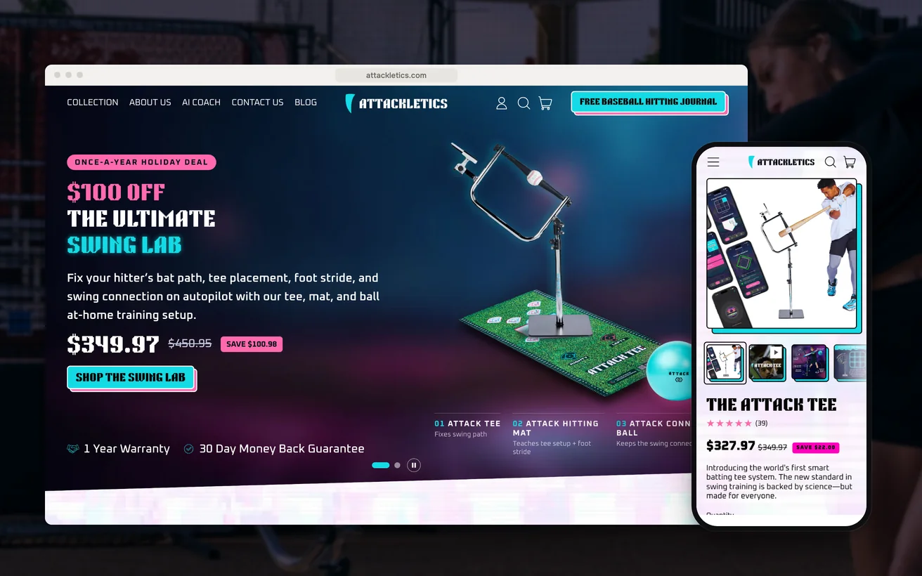
Attackletics' Shopify store on desktop and phone: the homepage and the Attack Tee product page
Client
Attackletics
Sector
Sports technology
Market
United States
Timeline
6 weeks
Services
Shopify Development, CRO
2×

Sales

+35%

Order value

As reported by the client.

01 The challenge

Attackletics build a smart batting tee and a coaching app for baseball and softball hitters, from youth players up to professionals. The hardware was finished. The app was finished. The brand also had a firm idea of how it should look: Japanese retro-cyberpunk, neon and scanlines and chromatic edges. Everything that usually holds a young product company back was already sorted.

The storefront had not caught up.

It ran a stock theme that sold the tee the way it would sell a garden hose. A visitor could not tell that the app existed, or that the people behind the product play the game. The gap between what the company had built and what the shop said about it was costing sales daily.

The obvious route was to export the look as artwork and drop the images into the pages. That buys the identity back and makes every phone pay for it in load time. These buyers shop on phones. A store that arrives slowly loses them before the argument for the product has even started.

02 Our approach

UX

We decided the product page would lead with the tee and the app working together, then the drill library, then the price. A batting tee is bought by a parent or a coach, and what they are weighing is whether a teenager will still be using it in March. The aesthetic would sit around that argument, never on top of it.

Technical

We chose to have the identity drawn by the browser rather than downloaded. The neon, the scanlines and the chromatic edges are effects the device renders, so the look arrives with the page instead of arriving after it. That single decision set the weight budget for everything else on the store.

Conversion

The app is the reason the tee is worth more than a tee, so we planned to sell the two on one screen. Plans, sensors and the drills a hitter gets would be presented beside the hardware as a single purchase decision. Buyers who can see what they are getting tend to buy the version with more in it.

03 Design & UX

Hierarchy does the selling. The tee and the app lead, the drill library follows, and the price sits below the reason to want it. What a stock theme adds by default and nobody reads was taken out: the rotating banner, the row of trust badges, the repeated newsletter prompt. What is left is the argument, in order, with the neon around the edge of it.

On a phone the effects step back so the content can lead. Contrast is spent where a decision actually gets made: price, size, add to cart. Tap targets are large enough to use one-handed, and the drill list collapses to something a thumb can move through. The look survives the small screen because it is not the thing doing the work.

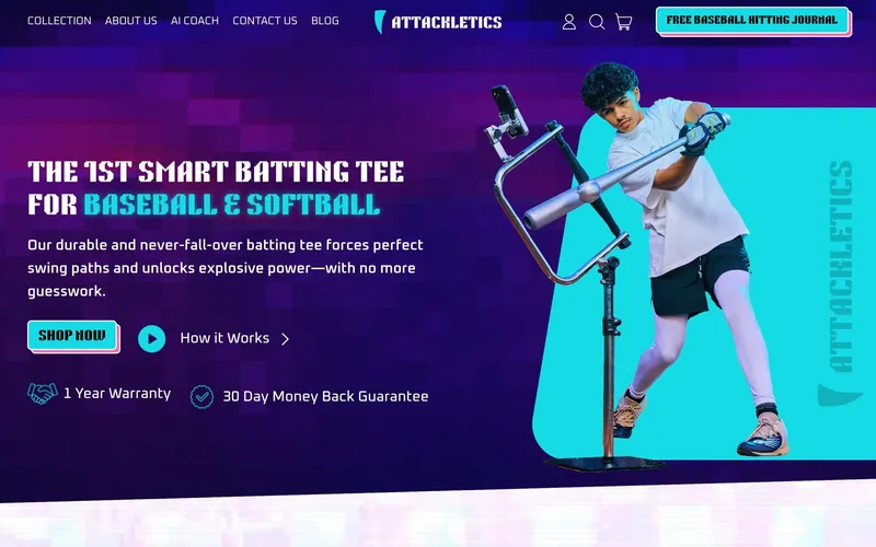
The Attackletics homepage on desktop

Identity drawn, not downloaded

The neon and scanlines are rendered by the browser, so the brand arrives with the page rather than a few seconds behind it.

App beside the hardware

The app is why the tee is worth what it is worth, so plans and drills sit next to the tee rather than in an upsell after it.

Contrast spent on decisions

Neon everywhere would bury the price and the size selector, so the strongest contrast on the page is reserved for those.

Reason before the number

Parents are weighing whether a teenager will still use the tee in March, so the argument for that comes before the price.

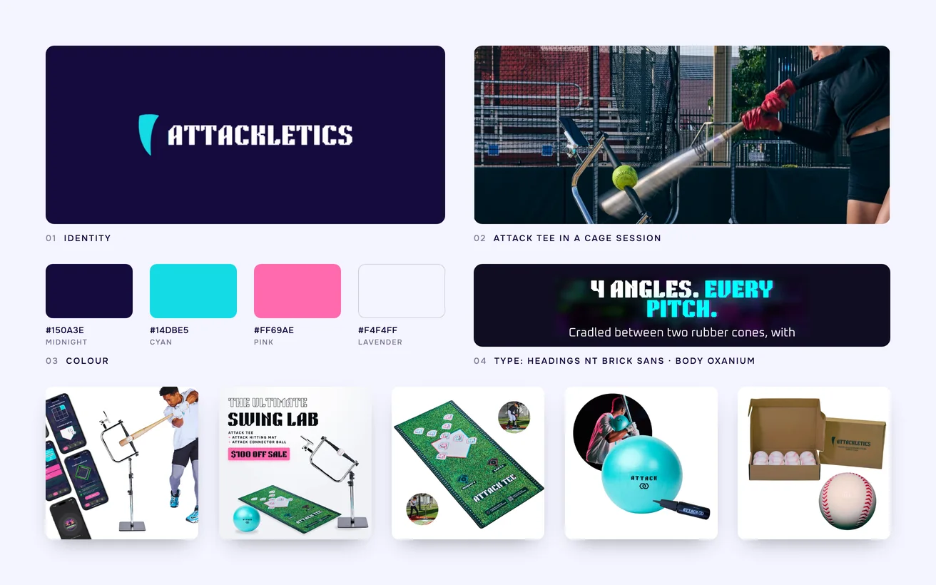
Attackletics brand board: logo, colour palette, typography, attack Tee in a cage session and the product range

04 Development & technical implementation

The store runs on Shopify with a custom Liquid theme. The neon, the scanlines and the chromatic edges are effects the device renders, which keeps the identity out of the image weight entirely. On a mid-range handset the store opens like a plain one. Product media is sized per device, and nothing above the fold loads that the page does not use.

One thing we got wrong. We argued for turning the intensity down, expecting bright neon on a small screen to cost sales. The founder held the line and was right: the look is why the brand gets remembered. We kept it in full and protected the metric elsewhere, by giving prices, sizes and buttons the strongest contrast on the page.

GA4 and Hotjar were wired in from launch, so the effect of the aesthetic could be watched rather than argued about. Klaviyo handles the post-purchase side, where the app matters most: a hitter who has started the drills is the buyer most likely to return for accessories. Session recordings settled layout questions that opinion could not.

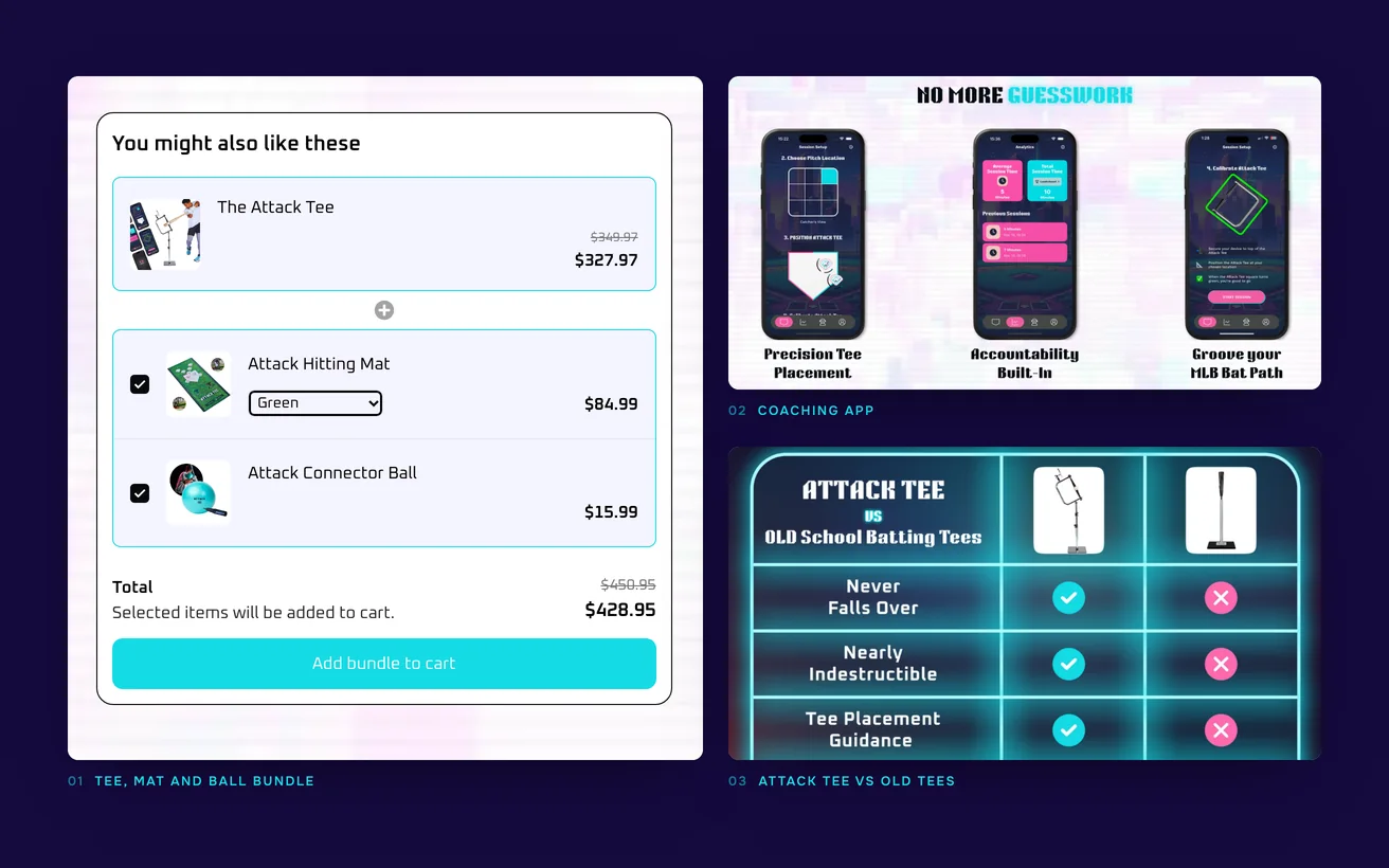
Close-ups of the Attack Tee page: the tee, mat and ball bundle, the coaching app and the comparison with old tees

05Key solutions

Key solutions.

The parts of the build a visitor would point at.

  1. 01

    Effects the browser draws

    The neon and scanline identity is rendered on the device, so the brand costs nothing in download weight and arrives with the page.

  2. 02

    Tee and app together

    Hardware, plans and the drill library are presented as one purchase decision, so buyers can see what the fuller version actually gives them.

  3. 03

    Fast on mid-range phones

    Media is sized for the device asking for it, so the store opens quickly on the handsets these buyers actually own.

  4. 04

    Checkout kept plain

    The aesthetic stops at the point of payment, where clarity converts better than atmosphere and every field stays easy to read.

  5. 05

    A store people share

    The look gives the brand something to post, so traffic arrives from recommendation as well as from advertising.

  6. 06

    Behaviour tracked from launch

    GA4 and Hotjar were live on day one, so layout changes are decided from recorded behaviour rather than from opinion.

06The result

The result.

What changed after launch.

2×

Sales

Sales doubled. That is a 2× lift with no change to the hardware, the app or the price. The store now says in the first seconds what the product has always been, and it says it to people who play the game. What changed is how many buyers got far enough to see it properly.

+35%

Order value

Average order value is up 35%. That figure is the app and the accessories being sold as part of the same decision rather than as an upsell after it. Each order now carries more of what the company actually makes, which is the cheapest kind of growth available to a hardware brand.

The look also gave the brand something to post with.

That was never written into the brief.

Not sure where to start?

Tell us the number that is stuck. A senior lead replies within one business day with an honest view, free.

Book a free consultation

or WhatsApp +91 70034 16634

9.9/10 client score · 150+ projects · 100% on time

07The finished site

The finished site.

Live, and running the business it was built for.

Visit the live site (opens in a new tab)
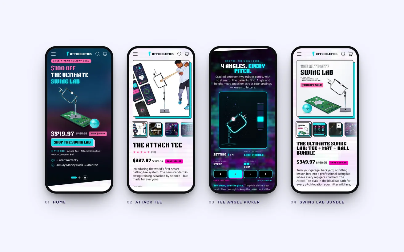
The finished Attackletics store on phones: home, Attack Tee, the tee angle picker and the Swing Lab bundle

08In their words

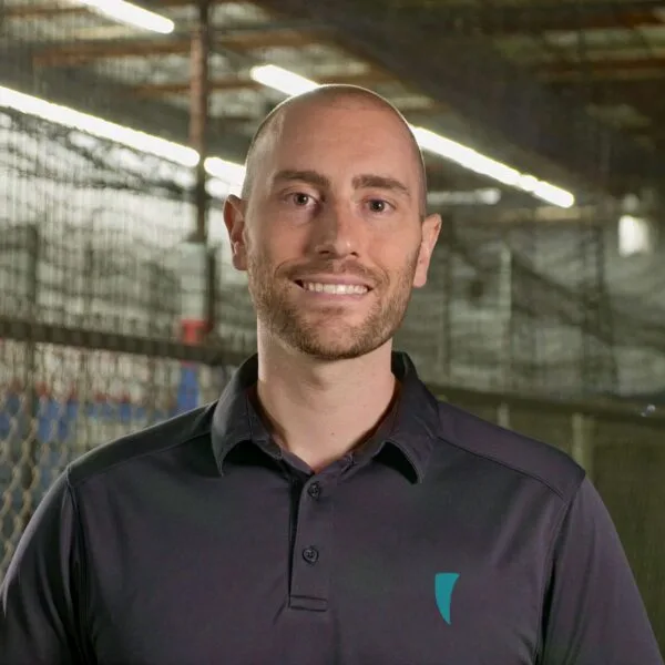
They pushed back on the design once, we said no, and they built it anyway without slowing the site down. That is rarer than it sounds.

Mike Rogers
Mike RogersFounder, Attackletics

09Tech stack

Tech stack.

What it is built on, and what it talks to.

  • Shopify
  • Liquid
  • GA4
  • Hotjar
  • Klaviyo

10More case studies

More case studies.

Other projects where we named the number before we started.

eCommerce

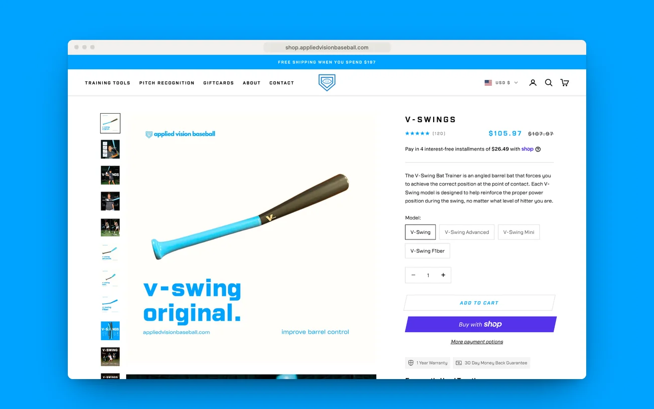
Applied Vision Baseball left a coaching site for a store that shows gear working.

Vision and swing trainers that make no sense in a photograph. Moved out of a coaching site and onto a storefront built around the demonstration.

Conversion
+46%
Organic traffic
+56%
View case study

eCommerce

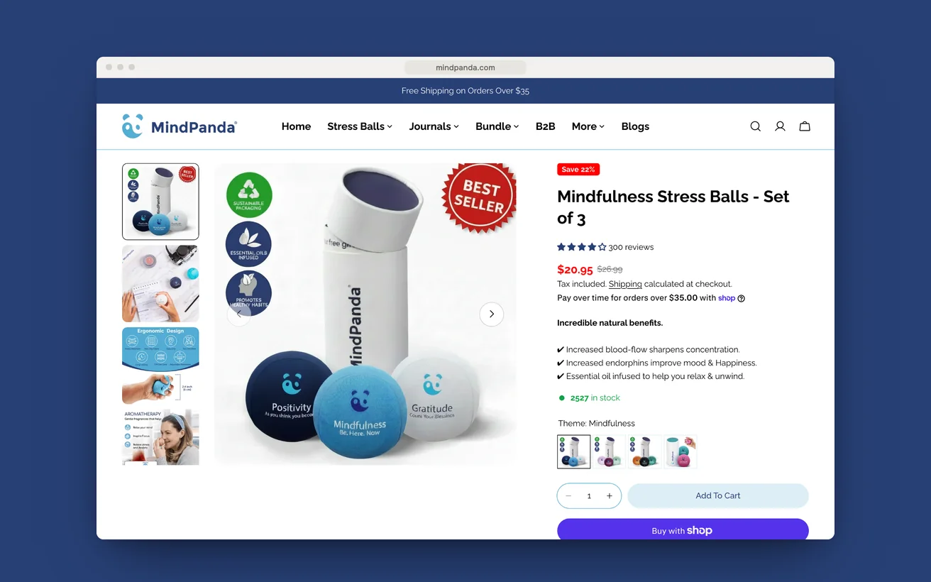
MindPanda built its own channel and pushed Amazon into second place.

An established Amazon seller with no channel of its own. Catalogue ported across, two markets configured, and a storefront designed to convert rather than list.

Direct revenue
7 figures
Channel, ahead of Amazon
No.1
View case study

eCommerce

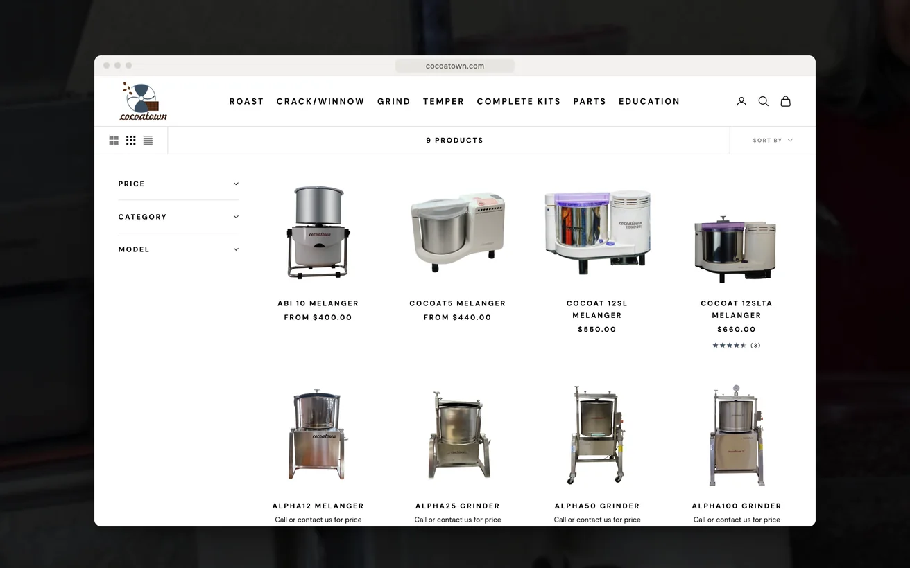
CocoaTown made a deep machinery catalogue shoppable and lifted sales 28%.

Bean-to-bar and nut-butter machinery sold in over a hundred countries. A deep technical catalogue, restructured around batch size and the stage a maker is stuck at.

Sales
+28%
Organic traffic
+39%
View case study

11Start a project

Let us look at your numbers.

Send the metric that is stuck and we will tell you honestly whether we agree.

  1. Within 1 business dayWe read it properly and reply with real questions, not a templated brochure.
  2. A 30-minute scoping callFree, no obligation. We tell you honestly if we are the wrong fit.
  3. A written proposalScope, timeline, deliverables and the success metric, all on one page.

You'll hear back from a senior lead, never a bot.

    What do you need?

    NDA on request · Details never shared

    Question about your project? Tell us in 30 seconds and a senior lead replies.