

eCommerce · 6 weeks

Applied Vision Baseball left a coaching site for a store that shows gear working.

Applied Vision Baseball make strobe glasses, reaction lights and swing locks, designed by players who use them. The gear sat several clicks inside a coaching content site that was never built to sell it.

30-min call with a senior lead · Reply within 1 business day · NDA on request

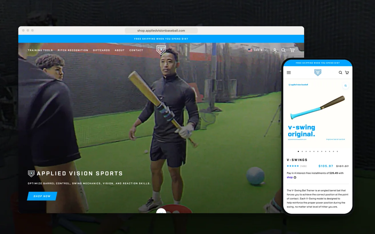
Applied Vision Baseball's Shopify store on desktop and phone: the homepage and the V-Swing product page
Client
Applied Vision Baseball
Sector
Sports training equipment
Market
United States
Timeline
6 weeks
Services
Shopify Development, CRO, SEO
+46%

Conversion

+56%

Organic traffic

As reported by the client.

01 The challenge

Applied Vision Baseball make vision and swing-mechanics trainers (strobe glasses, reaction lights, swing locks) designed by players who use them. The coaching content around the equipment had already done the hard part. Coaches knew the name, recommended the gear by model, and sent their hitters off to find it. Demand was arriving without being bought.

What those hitters found was a content site with the products several clicks inside it.

Navigation built for someone reading a drill article was asking a buyer to browse like a reader. The two audiences wanted different things from the same menu, and the buyer was the one losing. A recommendation is a short window and it was closing in the navigation.

The obvious fix was a tidier catalogue page. It would not have worked, because none of this equipment explains itself in a photograph. Strobe glasses look like sunglasses. A swing lock looks like a strap. Every recommendation a coach made was landing on a page that could not confirm it.

02 Our approach

UX

We decided to build the shop as its own storefront rather than another section of the content site. A coach reading a drill article is not mid-purchase. A hitter sent there by a coach should not have to read anything first. Separating the two let each stay simple, and let the shop be organised the way a buyer looks.

Technical

Speed and search both argued for a clean break. Product pages that sit at the top of their own store can be described in the words a player types, marked up properly and served fast. We planned the structure around the model names coaches say out loud, because those are the words that get searched.

Conversion

Most buyers arrive already sold, so we wrote the pages to confirm rather than to persuade. Model name, what it trains, what is in the box and which age it suits go high on the page. The demonstration runs before the copy. The brand story sits lower, where a curious reader can still find it.

03 Design & UX

Every product page opens on the equipment being used, not on a studio shot of it sitting still. The demonstration leads, the specification follows, and the price sits with the specification. A cheaper build would have led with a rotating hero banner, which is the one thing that tells a visitor nothing about what a swing lock does.

On a phone the clip is the first thing on screen and it plays without sound, because a hitter checking a recommendation is often somewhere they cannot listen. Below it, a short block answers the questions that used to arrive by email. Nothing else competes for the first screen, and the reading material stays where the readers are.

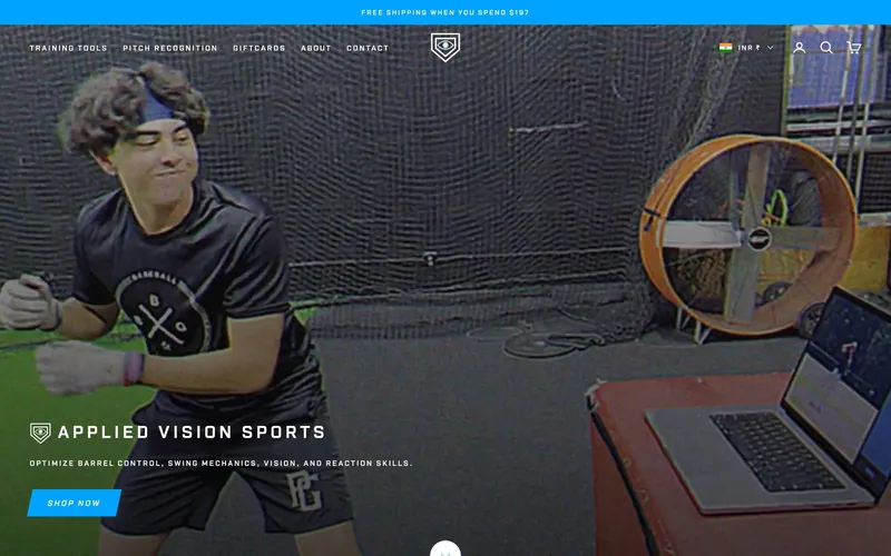
The Applied Vision Baseball homepage on desktop

Demonstration above the fold

Strobe glasses look like sunglasses in a photograph, so the page opens on them being used rather than on a studio shot.

Shop split from content

A buyer sent by a coach inherits none of the reading navigation, and the coaching site keeps the audience it was built for.

Confirmation before persuasion

Model name, what it trains and what is in the box sit at the top, because most visitors arrive with the choice already made.

Silent looping clips

The footage plays without sound so it works anywhere, and loops so nobody has to press anything to understand the product.

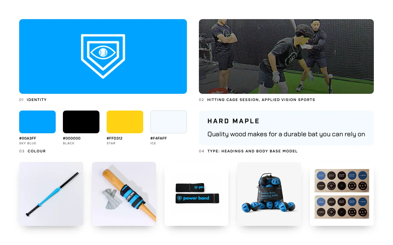
Applied Vision Baseball brand board: logo, colour palette, typography, hitting cage session, Applied Vision Sports and the product range

04 Development & technical implementation

The storefront runs on Shopify with a custom Liquid theme built around video rather than around a photograph. Media is compressed and served per device, so a demonstration can lead the page without costing the page its speed. Product data is structured so that a model name, its training category and its age guidance can all be filtered on.

The footage we had was coaching footage, shot to teach rather than to sell. Waiting for a product shoot would have cost more time than the launch had, and the season was coming. So we cut what existed into short silent loops and built the pages around their limits. The shoot happened later, into a store that was already trading.

Structured data and a clean URL structure went in before launch. The new product pages could then earn rankings of their own, instead of borrowing from the content site. GA4, Hotjar and Search Console were connected on day one. The team can add a product themselves, which keeps the catalogue moving without developer time.

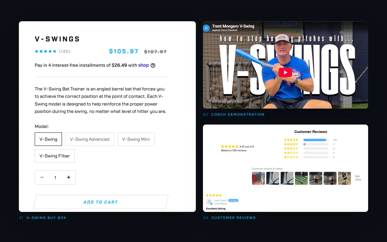
Close-ups of the V-Swing product page: the buy box with model options, the coach's demonstration video and customer reviews

05Key solutions

Key solutions.

The parts of the build a visitor would point at.

  1. 01

    Demonstration leads the page

    Each product opens on footage of the trainer in use, so a visitor understands what it does before reading a single line.

  2. 02

    Searchable by model name

    Pages are written around the model names coaches say out loud, which is what hitters type in when they go looking.

  3. 03

    Filter by what it trains

    Vision, reaction and swing mechanics are separate filters, so a coach recommendation leads to the right product in one step.

  4. 04

    Shop split from content

    The store has its own navigation, so buyers are never asked to browse a library that was built for readers.

  5. 05

    Confirmation details up top

    Model, what it trains, what is in the box and the age it suits sit high, where the decision is actually made.

  6. 06

    Fast despite the video

    Clips are compressed and served per device, so a demonstration-led page still opens quickly on mobile data.

06The result

The result.

What changed after launch.

+46%

Conversion

Conversion rate is up 46%. The equipment did not change and neither did the price. What changed is that a visitor now sees a trainer working within seconds of landing. That is the moment a coach recommendation either converts or leaks away. Nothing was added to the catalogue to get it.

+56%

Organic traffic

Organic traffic is up 56%. Splitting the shop onto its own storefront is most of why. Product pages that were buried several clicks inside a coaching site now sit at the top of their own. They are described in the words a player searches with, rather than the words a coach teaches in.

The store went live in six weeks, which mattered because it landed before the season rather than during it.

The team can also add a product without a developer now. That was never the headline requirement, and it is the part of the build they use every week.

Not sure where to start?

Tell us the number that is stuck. A senior lead replies within one business day with an honest view, free.

Book a free consultation

or WhatsApp +91 70034 16634

9.9/10 client score · 150+ projects · 100% on time

07The finished site

The finished site.

Live, and running the business it was built for.

Visit the live site (opens in a new tab)
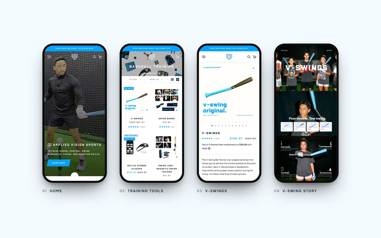
The finished Applied Vision store on phones: home, training tools, V-Swings and the V-Swing story section

08In their words

Nobody buys strobe glasses from a photo. The site finally shows them doing something, and we stopped answering the same question over email.

Mark Brooks
Mark BrooksFounder, Applied Vision Baseball

09Tech stack

Tech stack.

What it is built on, and what it talks to.

  • Shopify
  • Liquid
  • GA4
  • Hotjar
  • Search Console

10More case studies

More case studies.

Other projects where we named the number before we started.

eCommerce

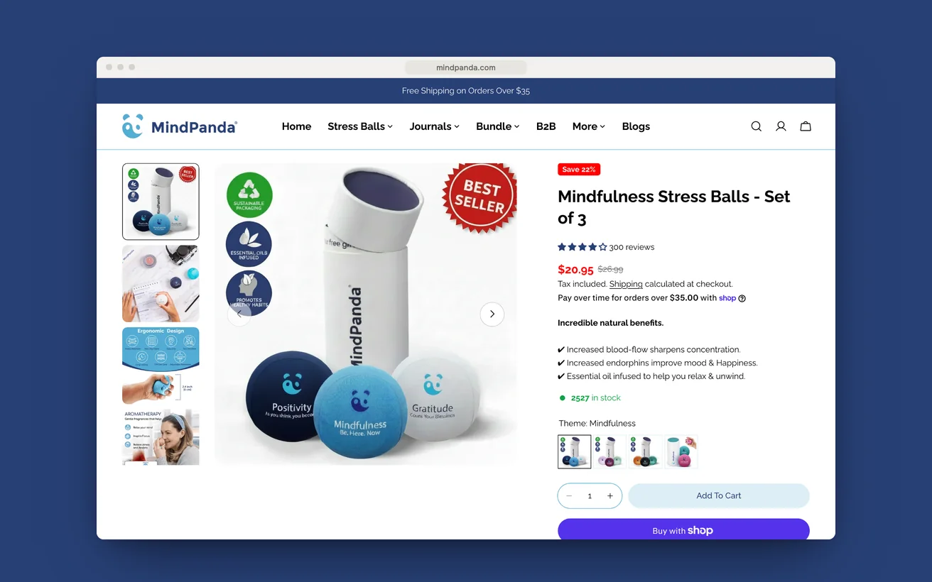
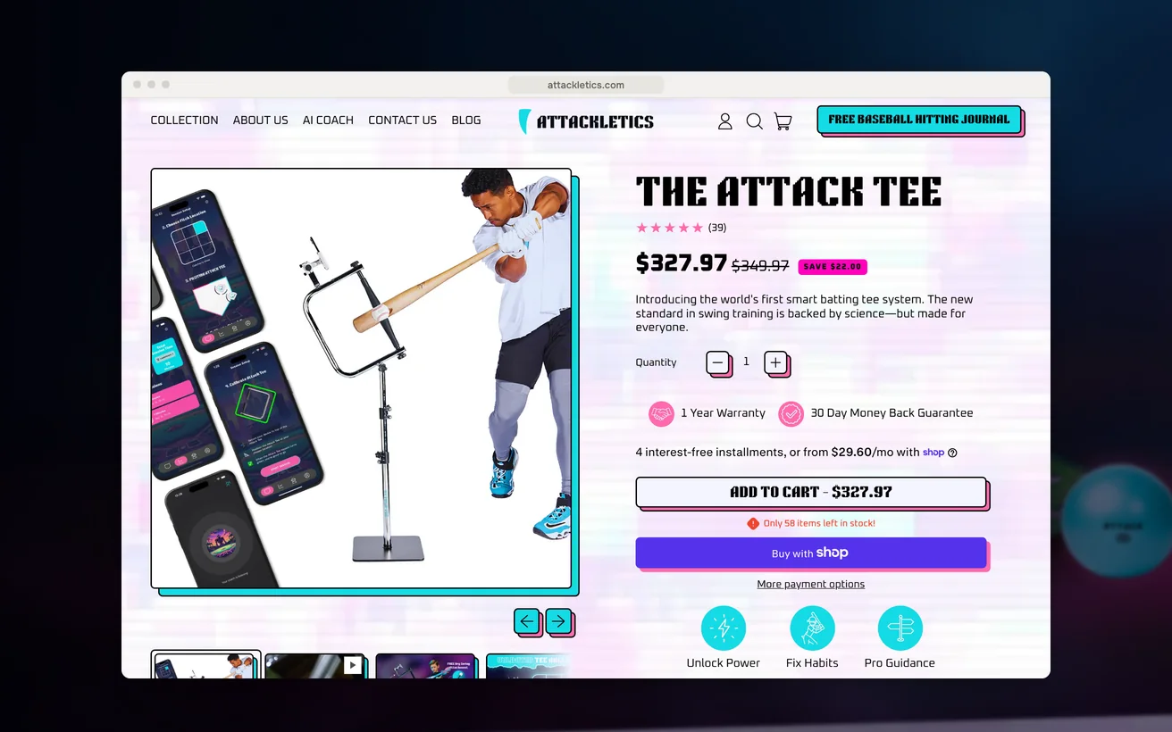
Attackletics doubled sales with a neon storefront that opens like a plain one.

A smart batting tee and a finished coaching app, sold from a stock theme. Rebuilt in neon and scanlines, without making the phone pay for it.

Sales
2×
Order value
+35%
View case study

eCommerce

MindPanda built its own channel and pushed Amazon into second place.

An established Amazon seller with no channel of its own. Catalogue ported across, two markets configured, and a storefront designed to convert rather than list.

Direct revenue
7 figures
Channel, ahead of Amazon
No.1
View case study

eCommerce

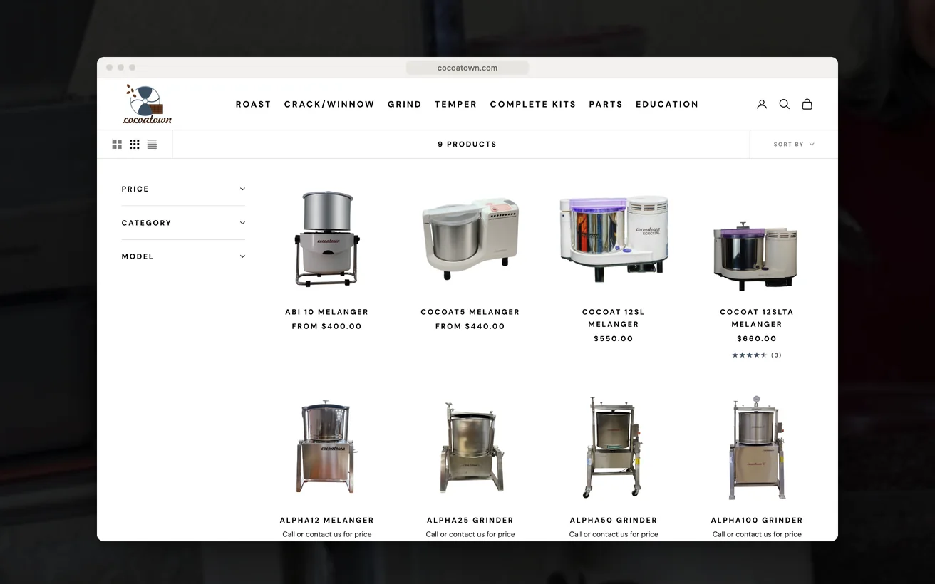
CocoaTown made a deep machinery catalogue shoppable and lifted sales 28%.

Bean-to-bar and nut-butter machinery sold in over a hundred countries. A deep technical catalogue, restructured around batch size and the stage a maker is stuck at.

Sales
+28%
Organic traffic
+39%
View case study

11Start a project

Let us look at your numbers.

Send the metric that is stuck and we will tell you honestly whether we agree.

  1. Within 1 business dayWe read it properly and reply with real questions, not a templated brochure.
  2. A 30-minute scoping callFree, no obligation. We tell you honestly if we are the wrong fit.
  3. A written proposalScope, timeline, deliverables and the success metric, all on one page.

You'll hear back from a senior lead, never a bot.

    What do you need?

    NDA on request · Details never shared

    Question about your project? Tell us in 30 seconds and a senior lead replies.